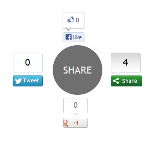
When it comes to attracting attention to yourself on the internet, nothing does a better job than share buttons. ;)
Whether its twitter or google plus, social media probably has a huge impact on your traffic. I set out to create an attention grabbing way to display buttons, and came up with this: a circle that expands revealing a bunch of Social Sharing Widget on hover.
This widget is created using Pure CSS3 and ShareThis social sharing plugin. This widget have 4 buttons: Facebook Like button, Google +1 button, Tweet button and main ShareThis button for more social sharing links.

Note: This Blogger Social Sharing widget animated zoom out feature will only work on latest Browsers and won’t work with Internet Explorer ( not tested with IE 10 ).
Add CSS3 Thread Out Social Sharing Widget in Blogger
1. Login to Blogger Dashboard > Design tab > Edit Html
2. Click on Expand Template widgets check box
3. Search for <div class=’post-footer-line post-footer-line-1′> HTML tag
4. And Put Below Code immediately after it
<b:if cond='data:blog.pageType == "item"'>
<style type="text/css">
.ringMenu {
width: 100px;
margin: 150px auto;
}
.ringMenu ul {
list-style: none;
position: relative;
width: 100px;
color: white;
}
.ringMenu ul a {
color: white;
}
.ringMenu ul li {
-webkit-transition: all 0.3s ease-in-out;
-moz-transition: all 0.3s ease-in-out;
-o-transition: all 0.3s ease-in-out;
-ms-transition: all 0.3s ease-in-out;
transition: all 0.3s ease-in-out;
}
.ringMenu ul li a {
display: block;
width: 100px;
height: 100px;
background: rgba(50,50,50,0.7);
text-align: center;
line-height: 100px;
-webkit-border-radius: 50px;
border-radius: 50px;
font-size: 20px;
}
.ringMenu ul li a:hover {
background: rgba(230,150,20,0.7);
text-decoration: none;
}
.ringMenu ul li:not(.main) {
-webkit-transform: rotate(-180deg) scale(0);
-moz-transform: rotate(-180deg) scale(0);
-o-transform: rotate(-180deg) scale(0);
transform: rotate(-180deg) scale(0);
opacity: 0;
}
.ringMenu:hover ul li {
-webkit-transform: rotate(0) scale(1);
-moz-transform: rotate(0) scale(1);
-o-transform: rotate(0) scale(1);
transform: rotate(0) scale(1);
opacity: 1;
}
.ringMenu ul li.top {
-webkit-transform-origin: 50% 152px;
-moz-transform-origin: 50% 152px;
-o-transform-origin: 50% 152px;
transform-origin: 50% 152px;
position: absolute;
top: -70px;
left: 50px;
}
.ringMenu ul li.bottom {
-webkit-transform-origin: 50% -52px;
-moz-transform-origin: 50% -52px;
-o-transform-origin: 50% -52px;
transform-origin: 50% -52px;
position: absolute;
bottom: -70px;
left: 50px;
}
.ringMenu ul li.right {
-webkit-transform-origin: -52px 50%;
-moz-transform-origin: -52px 50%;
-o-transform-origin: -52px 50%;
transform-origin: -52px 50%;
position: absolute;
top: 10px;
right: -50px;
}
.ringMenu ul li.left {
-webkit-transform-origin: 152px 50%;
-moz-transform-origin: 152px 50%;
-o-transform-origin: 152px 50%;
transform-origin: 152px 50%;
position: absolute;
top: 10px;
left: -50px;
}
</style>
<div class="ringMenu">
<script type="text/javascript">var switchTo5x=false;</script>
<script type="text/javascript" src="http://w.sharethis.com/button/buttons.js"></script>
<script type="text/javascript">stLight.options({publisher: "ur-e9856caa-8f3b-40a6-82af-461e390fe167"});</script>
<ul>
<li class="main"><a href="#main">SHARE</a></li>
<li class="top"><span class='st_fblike_vcount' displayText='Like'></span></li>
<li class="right"><span class='st_sharethis_vcount' displayText='Share'></span></li>
<li class="bottom"><span class='st_plusone_vcount' displayText='+1'></span></li>
<li class="left"><span class='st_twitter_vcount' displayText='Tweet'></span></li>
</ul>
</div>
</b:if>
4. Save your Template and Done!
Related Widget : Animated Social Sharing Widget with Cool Hover!
Customization
The demo and post codes are same. You have to adjust this widget with your blog design ( how do I know your blog design look like ;) ). No more customizations needed for this CSS3 Thread Out Social Sharing Widget CSS3 Thread Out Social Sharing Widget for Blogger for Blogger, but if you want you can replace ShareThis script with your regiestered ShareThis account script.
Once you’ve done that, save everything and check it out! Thanks for reading, and if you liked this little tutorial and socal sharing widget don’t forget to share. It really helps. :D
Click here for more stylish widgets
Nice and cool social sharing widget. It can enhance the option of sharing and it is unique in style. :)
Most of the sharing widgets are straight but it is in round shape. :)
Thank you
Surely it is a great widget but alas i am on word press and cant use that
You can use it in wordpress too. I will make another updated widget for wordpress. :)
Nice post, cool design… I am looking for a nice christmas widget
Add the social share buttons below post titles in blogger’ which make the blogger to some good and new look.
Abu Shaleh thanks youe post
It really looks great. I have check the demo of social sharing widget. It’s great.
Well, this is really an unique widget. I want to apply in my WP blog but will it work in WordPress ?
I will work with wordpress :)
really cool share button.. i like the animation and creativity..
Thnx for sharing..
That’s a really nice one. But where to use this one in a blog? I think inside your content…is it?
No Bro, Just below your blogs post.
Awesome Widget Shaleh but unfortunately I am using WordPress so please will you make the plugin for WordPress too.
Thanks :) and i will try to make a wordpress plugin.
Good One. which Place is more suitable for this social sharing widget to put?
Just after you Blogs Post Body.
Very Innovative Widget its great it would be more great if you had also made it for wordpress.
I will try to make a wordpress plugin. :)
Hi, are you using Marketers Delight skin?
yup, I’m using this! :D
I read a blogger article about after a month. :-D However, nice article for all blogger.com lovers. :-). But for me WordPress is 10 times better than blogger.
Yes wordpress is the best CMS. But, Blogger/blogspot is not too bad :)
its awesome , i will try and use it in my blog, it s great
Thanks Bro :)
hi Abu Shaleh its a nice widget but what if you shared a widget for wordpress as well, can we use it in wordpress or not….
Yes, you can use it in wordpress or any other CMS on problem :)