Social Media

How to Use Fiverr To Increase Your Blogs Social Media Presence

Fiverr can be a very useful medium to increase the social media presence of your blog. As we all know that for a blog to be successful it must have a wider reach and social presence. The later can be achieved by using Fiverr services efficiently. Fiverr is a place where you can hire people to get various things done for as less as $5. Fiverr is said to be the worlds largest online marketplace for small services. Each service that is offered on Fiverr is called a Gig. The smallest amount for a Gig is $5. If your not satisfied with a gig than you can cancel the order while it is in process. You will not loose any money in that case.
fiverr

You can use Fiverr to increase the number of Likes on your Facebook fanpage, or you can order Gigs which will help you gain more twitter followers. You can even get more subscribers to your blog using one or the other gigs that are available on Fiverr.

Get more Facebook Likes through Fiverr:

You can order one of the Gigs on Fiverr to get a handsome number of Likes to your Facebook fanpage. I will like to tell you here that there are various gigs on Fiverr which provide fake Likes or Likes from bots which are generated through some scripts and software’s. Likes from such sources are not very useful for blog until your just looking for numbers. You should carefully read the gig description before ordering a gig. If you find the description to be like this ” Get Facebook 1000 likes in 24 hours or Get 800 Facebook Likes in one day”, than you should know that this gig will provide fake likes.

Find gigs which look more genuine like, ” I will get my 50 friends to like your Facebook page”. This type of gigs will provide you with genuine likes. You can even contact the seller and ask him about his services before ordering any gig. The more genuine people that like your Facebook page, the wider reach your blog will have.

Read Also: Effectively Use Facebook To Increase Website Traffic

Get more Twitter followers through Fiverr:

Twitter has become one of the most used social networks and having a good number of followers will be great for your blog. If you don’t have much followers on twitter as of now than you can use one of the twitter gigs on Fiverr. There are various types of gigs on Fiverr related to twitter, some sellers offer guaranteed number of retweets, some offer guaranteed number of followers and some sellers even offer to design custom twitter background for your account. But there are various sellers which provide fake followers so beware of it and contact the author to clear any doubts before ordering the gig. If you are not satisfied with the seller’s service than you can cancel the gig anytime while it is in process.

Other Services:

Above are the two most popular services on Fiverr which can help you increase your blogs social media presence. But there are alot more services which you can order on Fiverr which will be very helpful for your blog. Some sellers provide gigs which submits your blog to various top bookmarking websites which in-turn creates quality backlinks, but i will remind you here to choose carefully because there are various fake gigs too. Several gigs offer SEO services as well which are very effective at times. I have personally used Fiverr gigs for a couple of tasks which have helped me alot. Read Also: Top 10 Off Page SEO Techniques
Share your experiences that you had on Fiverr and what you have used Fiverr for? Drop your comments below!

Facebook Activates Its Timeline For All: How To Use It

The wait is over: After months of several testing and offer a “voluntary change” to its users, today is the deadline for Facebook suits us all to your new Timeline or Chronology. The change is not sharp since, at least cautious, we could try it with a lot of anticipation to see what news brings Timeline. However, many people who follow the profile “old” so over the next few hours will see how everything is migrated to the new Facebook design.

It is possible that many do not like the new design of Facebook, but the truth is we have no escape. Timeline is fit or leave Facebook (something that happens almost all the changes in the social media). Therefore, we will take a moment to understand how we can do to make the most of this change.

facebook Timeline

Let us start from the basis that the change to Timeline is almost a reconfiguration of the whole philosophy of Facebook. The idea is that we begin to share our whole life , not only loose updates. Timeline So not only allows us to share music, links, videos, and photos, but we can take all these elements to tell a story, a story about us. So find the side of a timeline Timeline we can customize to show our birth, major events such as graduation from secondary or college, and more.

So before making the switch to Timeline (or Facebook do it for us), should ideally review our privacy settings for something we published in 2008 did not come to surprise us overnight. Everything can hide and remove, and Facebook is an algorithm designed to display events and publications.

Read Also: How To activate facebook timeline?

What are the major changes?

A recent study conducted by Simply Measured indicates that, with Timeline, many companies have increased the number of interactions and engage with their users on Facebook. While the presence of firms in social networks and is unavoidable, it is good to know we have a professional tool to do so.

Timeline Facebook power capabilities and gives us a chance to tell the story of the brand, create a more personal story with our users and customers, and again all more verbose. Especially with big brands, usually Facebook is a great flood of inquiries, insults, flattery: a true bipolar grout comments. So to get everything organized is essential to make the page easier to navigate and users to find everything easily.

Read Also: Remove Facebook Timeline In Firefox and Chrome Completely

Some final tips –

  • Are you ready to spend a timeline? Keep in mind these things:
  • Hide what you do not want others to see
  • Check your privacy settings before and after applying the change
  • If you want, create a timeline of life through photographs
  • Set up your Timeline so that only includes what you see and what you want others to see you
  • Have ready a good image to work as your cover photo.

This is guest post by Amrik Virdi who writes about How To Make Money Online.

How to Add Three Column Footer Widget in Blogger

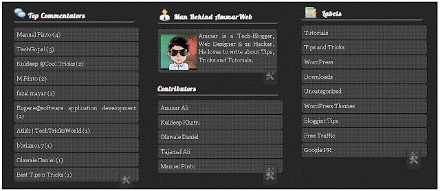
You might have seen a three column footer at many professional or commercial blogs. Where you can add stuffs. Take my three column footer as example. Footer make visitors busy and give him a good impression at End of your blog. It contains 3 columns widgets where you can add your own choice of widgets. You can easily Three Column Footer Widget and customize it as you want. If you are using WordPress Thesis Theme than check out this tutorial to add Footer Widget  in Thesis. See a screenshot.

footer


Follow these steps, to add Three Column Footer Widget

Step 1:

Go to Blogger Dashboard > Design > Edit Html

Step 2:

Backup Your Template

Step 3:

Search for ]]></b:skin> now paste the following CSS code just above ]]></b:skin>

#lower {
border-top: #737373 6px solid;
margin:auto;
font-family: Georgia;
width: 960px;
padding: 0px 0px 10px 0px;
background:#1f1f1f;
}
#lower a {
color: #DBDBDB;
font-family: Georgia;
}
#lower-wrapper {
margin:auto;
font-family: Georgia;
padding: 20px 0px 20px 0px;
width: 960px;
}
#lowerbar-wrapper {
background:#1f1f1f;
float: left;
color: #ebedee;
font-family: Georgia;
margin: 0px 5px auto;
padding-bottom: 20px;
width: 32%;
text-align: justify;
font-size:100%;
line-height: 1.6em;
word-wrap: break-word;
overflow: hidden;
}
.lowerbar {margin: 0; padding: 0;}
.lowerbar .widget {margin: 0; padding: 10px 20px 0px 20px;}
.lowerbar h2 {
margin: 0px 0px 10px 0px;
padding: 3px 0px 3px 0px;
text-align: left;
color:#fff;
text-transform:uppercase;
font: bold 16px Arial, Tahoma, Verdana;
border-bottom:3px solid #666666;
}
.lowerbar ul {
list-style:none;
margin: 0;
padding: 0;
}.lowerbar li a {
width: 265px;
font-family: Georgia;
background: #3f3f3f;
border: 1px solid #111;
line-height: 1.4em;
-moz-border-radius: 5px;
padding: 0.5em;
margin-bottom: 11px;
margin-right: 3px;
-webkit-border-radius: 5px;
overflow: hidden;
color:#000000;
}.lowerbar li a:visited {
width: 265px;
font-family: Georgia;
background: #3f3f3f;
border: 1px solid #111;
line-height: 1.4em;
-moz-border-radius: 5px;
padding: 0.5em;
margin-bottom: 11px;
margin-right: 3px;
-webkit-border-radius: 5px;
overflow: hidden;
color:#000000;
}.lowerbar li a:hover {
background: #4f4f4f;
border: 1px solid #7a7a7a;
line-height: 1.4em;
-moz-border-radius: 5px;
padding: 0.5em; -webkit-border-radius: 5px;
overflow: hidden;
color:#000000;
}.lowerbar a {
font-family: Georgia;
background: #3f3f3f;
border: 1px solid #111;
line-height: 1.4em;
float:left;
-moz-border-radius: 5px;
padding: 0.5em;
margin-right: 3px;
margin-bottom: 11px;
-webkit-border-radius: 5px;
overflow: hidden;
color:#000000;
}.lowerbar a:hover {
background: #4f4f4f;
border: 1px solid #7a7a7a;
line-height: 1.4em;
-moz-border-radius: 5px;
padding: 0.5em; -webkit-border-radius: 5px;
overflow: hidden;
color:#000000;
}

Step 4:

Now search for </body> and paste following code just above </body>

<div id='lower'>
<div id='lower-wrapper'>
<div id='lowerbar-wrapper'>
<b:section class='lowerbar' id='lowerbar1' preferred='yes'>
<b:widget id='HTML12' locked='false' title='Testing' type='HTML'/>
</b:section>
</div>
<div id='lowerbar-wrapper'>
<b:section class='lowerbar' id='lowerbar2' preferred='yes'>
<b:widget id='Profile1' locked='false' title='About Me' type='Profile'/>
<b:widget id='HTML5' locked='false' title='Recent Comments' type='HTML'/>
</b:section>
</div>
<div id='lowerbar-wrapper'>
<b:section class='lowerbar' id='lowerbar3' preferred='yes'>
<b:widget id='HTML3' locked='false' title='Top Commentators @ AmmarWeb.Tk' type='HTML'/>
<b:widget id='HTML9' locked='false' title='Our Partners' type='HTML'/>
</b:section>
</div>

<div style='clear: both;'/></div></div>

Step 5:

Save your template .Now visit the page Layout > Page Elements and start adding widgets! :>>

Customization

You can easily customize the look and colours of the this footer widget. I have bolded the important parts in the CSS code above. Read the descriptions below carefully to better stylize your Three Column Footer Widget.

  • background:#1f1f1f; Changing the six digit colour code will change the background colour of this widget.
  • width: 960px; This is the width of the widget. If you want you can adjust this width value in accordance with the width of your blog.
  • background:#fff; and width: 32%; is the background colour and width of the three columns where the widgets are added.
  • color:#0084ce; This is the Colour of Title Headings
  • font: bold 14px Arial, Tahoma, Verdana; Edit this to change the font size and family.
  • border-bottom:3px solid #0084ce; Edit this to change the thickness, style and colour of the border that appears at the bottom of Title Heading
That’s All
A new tutorial on four column footer will be soon posted till than enjoy this one. Now Three Column Footer Widget is added!