Design

Show Me Your Blog Design and I’ll Show You Your Blog’s Future

I won’t agree with you if you tell me that your blog design has nothing to do with your traffic and how you make money online.

If I should show you two houses, one with a beautiful design and the other with a rough design and voluntarily ask you to choose one out of it as a gift (I wish I could), you’ll definitely go for the one with a beautiful design.

Let’s draw this back to the aspect of blogging.

Your blog design has a great role to play; it’s the first thing to consider before thinking of writing quality content, generating traffic or making money online.

Definitely it can affect your blog in a positive way and also in a negative way, a good design attracts visitors while a bad design bids them farewell.

blog design

What are the blog designs that can affect your blog and how can you avoid them?

1. Use a simple theme

Too much of everything is bad, there’s this saying that goes thus “one man’s food is another man’s poison”. You might optimize your theme in a way that will look good to you but do you know if it looks good to your readers?

I have an idea, why not ask friends or other bloggers you’ve created connections with to check out your blog and tell you their opinion about your design.

If you get a negative answer from three different bloggers then you must make a change to your blog design. Make your blog design simple and avoid over optimization. It’ll not only make your blog look good but will also welcome visitors to your blog.

There’re many sites that provide premium WordPress Theme. But Below I’m sharing 2 top and best, affordable WordPress Club That provide great Premium WordPress Themes!

ElegantThemes – Looking for great, professional looking, elegant style wordpress themes? Elegant themes have it all. They provide great quality wordpress themes. Get 100% complete access to their entire collection of 76 themes for only $39!

Theme-Junkie – ThemeJunkie provide best wordpress Themes for very low price, Professional looking, Fast loading and great lifetime support.

2. Navigation counts

You’re building an empty desert on your blog if readers find it difficult to navigate through your blog.

I’ve received few messages from bloggers contacting me to check their blog if it’s eligible for google adsense and to my surprise, most of the blogs have no navigation at all. I managed to type “/contact” after the blog URL in order to get to the contact page, I know that’s a no-brainer.

If a visitor visits your blog, will they find it easy to contact you or know more about you? Those pages are very essential, you also need to group your blog posts into categories; this will make it easy for readers to access your blog. You can make navigations easier by placing your pages at the header and at the footer of your blog, it really counts.

3. Font types and size

Of course, you want to make your blog beautiful and attractive by using fancy fonts.

Before doing this, the question you should ask yourself is; will my readers be able to read my blog content?

If yes, then you’re safe but if no, there are two things involved. It’s either they put on a google glass for easy readability or they won’t bother stressing their eyes thereby leaving your blog. The size and type of your font matters a lot. There are fancy fonts that can slow down a blog and of course, you know we’re all in a hurry. If I should visit your blog and find out that it has a lazy load, I won’t hesitate to leave your blog. So try as much as possible and optimize your fonts for your readers and not for yourself.

blog design

4. Using multiple colors

The eyes naturally gets attracted to anything colorful but too much of it is a distraction to the eyes. The maximum number and range of color you can use on your blog is around 4 – 6 major colors, it depends on the theme of your blog. If you’re using a red theme then the background of your navigation bar and sidebar title must be red, your blog background color can be different and your footer color can be different too, making it a total of 4 colors on your blog. This makes your color a uniform and professional. Avoid multiple colors on your blog; it’s nothing but a color riot.

Conclusion

Go back and do some architectural work on your blog, I’m sure you know how it looks like. Try to make some amendment if you fall on any of the categories mentioned above.

Remember, a bad blog design welcomes a high bounce rate and a high bounce rate can get your blog de-ranked.

I’m sure these tips are definitely incomplete; I would love to hear your view.

Have you previously fall into any of these categories? How did they affect your blog?

Secrets for Attracting Tons of Clients to Coming Soon Pages

Is it difficult to attract clients and traffic to your Coming Soon page? Wouldn’t it be nice to have a whole bunch of potential clients waiting in line for your website to open?
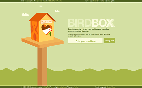
 
Not only are these potential clients waiting for your site to open, they’re almost guaranteed to hire you for your services.
 
A well designed website isn’t built in a day, neither is it built in a week. Ingenious design, tons of experience and attention to detail are put forth when a website is created.

Some people choose to hand out business cards or wait for the website to launch so they can promote their business, while others prefer a different calling card. This calling card is the convenient coming soon page.

The coming soon page acts not only as a placeholder but also as a means of announcing a new site whether it’s new, just having a makeover or undergoing some routine maintenance.

Other than the coming soon page acting as a placeholder, it also acts as a landing page. In general, coming soon pages should be simple and minimalistic; they don’t generally sport the bells and whistles that a fully rendered site would.

An effective coming soon page is important for several reasons but the most important reason is to draw the visitors back once your site is officially launched.

Making a coming soon page isn’t the hard part. You’ll be fine as long as you know there are a few things you need to pay close attention to during the design process. There are also some great resources online that can help you with the development and design.

However finding clients who are actually interested in using your services is the hard part. I’ll show you how to attract clients & Ultimate Secrets For Attracting Tons of Clients to Coming Soon Pages not just random traffic, but targeted traffic that are in your niche. I’ll show you how to retain that targeted traffic, convert them and make them come back to your site again and again. These are the secrets to Attract Clients.

Secrets for Attracting Tons of Clients

Build Hype

How would you expect people to find you if you don’t show anyone where you are? Unless you enjoy playing hide and seek, you need to get the word out there and get your site recognized.

One of the best ways you can do to attract clients to coming soon pages is by guest posting.

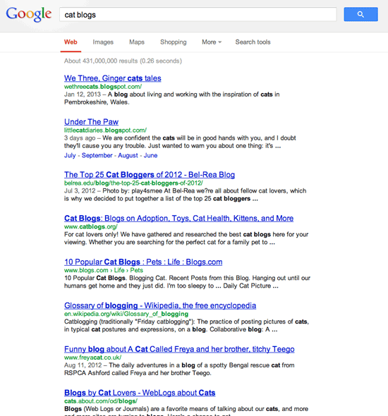
Let’s say you’ve created a coming soon page for a client who specializes in pet food. You can go to Google and search for “pet blogs” or to be more specific, “cat blogs”. You need to then contact the owner of the blog and ask them if they accept guest posts.

Try your best to find the name of the founder of the blog. Using the name of the blogger in the email will make it look more personal and you’ll be more likely to get a good response back.

After you receive an acceptance, you’ll have to start writing a draft. There are some great sites where you can learn how to guest post. I’ll summarize them for you below.

  • Headline

50% of the guest post is done if you’ve created a great headline. A good headline should be irresistible so that it attracts a huge audience of readers.

  • Introduction

By writing a good short introduction, it should make the reader want to read the first line of your post. And then they should read the second line. Hopefully these first few lines make the reader end up reading the whole post.

  • Content

The content should be both actionable and interesting. By reading your post, the reader should be able to take something away and use it. You’ll have a more loyal following if the readers take action after reading your post. Read more about creating engaging content.

  • Call to action

Give a short conclusion of the post and ask the readers a question. This will get the readers involved and hopefully you’ll get some comments. Be sure to reply back to each and every one of those comments so that you can build a relationship and get more readers back to your site.

The blog should allow you to have a short bio at the end of your post. Be sure to get this clarified when you contact them about doing a guest post.

Include one link to your coming soon page and another link to your social media outlet such as Twitter or your Facebook fan page. At most you should add up to three links in the bio, anymore and it looks like you’re only interested in getting traffic from that blog (which you certainly are but you don’t want to let them know ).

Here’s a good tip if you’re trying to rank on Google. If your website is about reviewing design books and your trying to rank for the term “design books” then you need to place this as an anchor text.

For instance, “Rahat reviews awesome design books (anchor text) that you just don’t find anywhere else.”

The more guest posts you do, the more Google will trust your site and therefore increase your rankings. Be sure not to write the exact same byline on each post you do as Google doesn’t rank pages with duplicate content.

You’ve thrown in the bait; all that’s left now is to reel in the fishes

So you’re now getting a decent amount of traffic, but what are those visitors supposed to do once they’ve reached the coming soon page?

It’s no good having tons of visitors if they don’t come back again after the website has opened. Let’s face the sad reality, people have more important things to do rather than remember the launch date of your site.

A way to solve this problem is to use opt-in forms and utilize great design. The latter will be explained later, but for now let’s talk about opt-in forms.

Opt-in forms are an easy way to capture your readers and tell them about your launch date. Even after you’ve launched your website, you’ll have a whole list of subscribers that you can regularly email your services to. If you send emails too frequently then you’ll seem like spam. However, if you send your readers a mini guest post and at the end of the email you mention your services, you’re guaranteed to see a better result.

You can use a free service such as Feedburner to capture the emails or for advanced options such as in-depth statistics, you could use services such as Aweber or MailChimp. You can also give a try to WordPress Plugins like Subscribe To Download

Simplicity is the ultimate sophistication – Leonardo da Vinci

Whenever I view a spammy looking website asking for my email address, there is no way in hell I’m putting in my details. It’s just my natural reaction to bad design.

You also do the same right?

However, if a website has been designed well and tells me the benefits I’ll receive, I’ll be more that happy to sign up to it.

I’m sure you already know this, but Good design builds trust and stability. It differentiates you from your competitor and reduces the client’s fear in hiring you for your services.

Be Original

No one likes a copycat so you want to make sure that your page is original. Sure the coming soon page isn’t going to be there forever but people will remember it and if it isn’t original, chances for those visitors to return is slim to none.

Originality can show up in different kinds of forms in regards to your coming soon page. One way to shake things up is to pick an interesting layout. Most coming soon pages like to stay simple with some large graphic and then their subscription form somewhere underneath the graphic or beside it.

Try defying the standard looks and try moving the page elements around. If your site is to work as your personal portfolio or is a business that offers services you most definitely want to have some personality shine through in whatever way possible.

A great way to inject some personality into the page is by using color. Colors are important and can help convey meaning so make sure you choose wisely. Graphics also show personality especially if you’re utilizing a mascot for your site. Bold colorful characters are great to use if you’re using a mascot.

Your originality can also shine through by the wording you choose to use. Instead of your everyday mundane “Coming Soon 2/12/2013” try to go off of what your website is about to create a more catchy “slogan” if you will.

Is your Coming Soon page descriptive?

Though coming soon pages are generally minimalistic, you do need to put some sort of information on it about what you do. The main purpose of this page is to tell and announce the coming of a new site.

Though just having the words “Coming Soon” in a large font gets the point across, it’s typically not enough. By all means you don’t have to launch into a thirty-page mission statement as no one’s going to read it unless they’re seriously are bored.

Keeping to a few sentences or even a paragraph or two will do perfectly fine. Some things you’ll want to touch base with when offering some explanation to the visitor is of course your name. After that you’ll more than likely want to follow it up with a little about the site and the service you provide.

Launch dates are exceptionally helpful as it gives the visitor a clue to when the site will actually be up and running which is always a good idea. You don’t have to do this if you’re certain your site will be up within a couple of weeks but if your site won’t be launched until Summer 2013 you might want to make that known to your visitors.

Before I explained how opt-in forms can help you convert your traffic into subscribers. Well a good brief explanation of your site can also bring readers back to your site. If you’ve done a great job explaining your site, visitors will more than likely bookmark it and make sure to return when it’s officially launched.

Use Social Media

You shouldn’t have anymore than 4 social media icons as having too many options causes analysis paralysis, which then impacts on how much your website gets shared. The three main social media outlets I recommend are Twitter, Facebook and Google+. If you have interesting images on your site then I also recommend you use Pinterest.

Online marketing, especially when done to its maximum capabilities, has the power to push your website to unknown boundaries.

Many online marketing campaigns have proved this with some sites getting at least 60,000 daily unique views while constantly amassing both Facebook and Twitter followers, the power is literally at your fingertips.

You can either make your own social media icons or download some pretty decent icons online. The social icons will bring the visitors closer to you and once the “followers” and “likes” start flowing in, you are free to start keeping your newly acquired fans up-to-date with the progress of the site and of course the launch date.

How will your ‘coming soon’ page look like?

Naturally you’ll need to experiment with what works best for your audience and website. Some of these tips may seem small, however once they start adding you’ll be able to see a huge snowball of targeted traffic.

Since I manage a design blog, I often get asked to help people with their project proposals. This post is ideal if you’re creating a website for your client. You can add an extra option in the proposal and charge for the service. Such as:

–        Make “coming soon” page and integrate with email subscription form

–        Create social media accounts and customize them to draw new audience

–        Guest post on blogs to attract potential clients to website

(If you don’t want to do the guest post, you can always ask the client to do it, as they should have a lot of knowledge about their niche. You can also hire great copy writers online.)

Now to you

Hopefully you’ve learned something new that you can use in your next project and also attract clients to your pages.. You may also want to bookmark this post for future reference.

Was this Secrets for Attracting Tons of Clients to Coming Soon Pages Guide useful? Are there any other tips about attracting clients to Coming Soon pages you could share? Let us know in the comments below.

If this article was useful, don’t forget to share it via the share buttons below.

5 Unusual But Important Places to Add Subscription Box

Money is in the list.

All of us know this. That’s why you should care about increasing your subscribers.

A lot of blogs shows to you the most common places to add your subscription box, but I thought why don’t we share the uncommonly used places and that can bring us more subscribers.

So, usual places + unusual places = more subscribers and most importantly more money.

If you are really looking for places to increase your subscribers, you are on the right place, so continue reading. …

Selecting Your Blog Design Theme

If you wish to earn money with blogs or doing blogging for money, you will find a variety of options to think about, for example: What your blog’s focus ought to be, where it ought to be located, what advertising programs you need to use, and exactly what the blog need to look like. When it comes to the feel and look of the blog, you will want to select a great blog theme. WordPress may be the top blogging service and you’ll find lot of different WordPress styles available to select from. See Also. : 6 tips to design your website like pro.

Blogging For Money

Themes for blogs could be free of charge, premium, and custom. Here are a few benefits of Selecting Your Blog Design Theme and drawbacks of three options:

Free Blog Themes

A totally free theme has got the large professional it is provided for free. But it is frequently have a couple of cons because of that $ cost. You’ll routinely have to help keep links within the footer from the site, listing the designer’s title and URL. You will also have limited options when it comes to altering the appearance and the design of your blog. You might discover that your site does not look everything unique from others because many writers opt for a totally free WordPress theme and you will find only a lot of offered out there. Another disadvantage of free options is you will not have the ability to rely on any tech support team for those who have an issue. It is a “use at the own risk” kind of factor. You can choose these free themes for your wordpress or blogger blog.

Premium Blog Themes

Premium styles for WordPress include tech support team and several options. They are typically very easy to customize, too, meaning you are able to change photos and colour schemes, and simply manipulate the headers and footers. They routinely have some popular features and therefore are highly enhanced for search engines like google, which could improve your capability to easier get the blog available on search engines like google. Premium options include a fee attached and you will want to be certain you purchase from the trustworthy templates marketplace to ensure that you’re pleased with your outcomes. Below are most commonly used top premium wordpress theme providers.

Custom Blog Themes

Custom blog themes may have all you want in addition to connected support. But they are likely to include the steepest cost you’ll also find to hold back as the programmer produces the theme for you personally. You can also hire us to design your template or theme in cheap rates.

Selecting your site theme is really a personal decision. Whether you decide to go with free, custom, or premium, search for something that will assist you to increase your blog’s success. Search for simplicity of use, great looks, as well as for something which can help you achieve the goals you’ve for that blog.

6 Simple Yet Effective Tips To Design Website Like Pro

web

Think of the websites you visit the most — chances are they are clean, professional, and easy to navigate. This is no coincidence: the human mind takes just a millisecond to make a definitive decision as to a site’s credibility, and this initial judgment is based entirely on aesthetics which means a good web design is critical for retaining visitors. Even the load time of the website matters the most, described below are 6 Simple Yet Effective Tips To Design Website Like Pro that you should follow to make your website look like pro.

See Also: Power of The WordPress Website Design

  • 1) Plan Your Site: Before turning on your computer, consider the layout, page structure and how users will move from one page to another (navigation). Then, sketch out your site on paper.
  • 2) Understand Your Audience: Knowing your audience will help set the tone for your content and layout, as you identify what visitors will be looking for on your site. It’s also important to consider popular web browsers and your visitor’s screen resolution size so that they see your site the way you intended; you can find this data in most site analytics tools. If you’re not sure how wide to make your site, 960px is a great place to start.
  • 3) Allow for Easy Navigation: Since people often read from left to right and top to bottom, the upper left-hand corner of your site is the first place your visitors will look. Place your navigation buttons here and keep them consistent, along with font and color choices, for easy reading and fluid movement from page to page.
  • 4) Choose a Color Scheme: If you’re designing your site around an image, try uploading it to a color palette tool, like DeGraeve.com‘s, for example, for complementary color suggestions. Be sure to remain consistent with your design patterns, and stick to no more than three font types and colors.
  • 5) Use High Quality Photos: In order to give your site a more professional appearance, all images should be clear, focused, and of high resolution. An alternative to taking your own photos is buying them from istockphoto.com; at about five-dollars an image it’s an inexpensive way to visually take your website to the next level.
  • 6) Test Your Site, Then Test Again: When you’ve created or redesigned your site, ask friends and family to test it for you. They may find things you’ve missed, or point out areas of confusion.