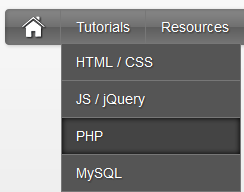
Since the Apple-flavored Leopard-text-indent style is currently one of my favorite menu styles. So Today We just came across Stylish Apple Mac Style Drop Down Menu With Search Box. Its a simple yet stylish mac style drop down menu for blogger and wordpress and for any other use. It consists of only CSS + HTML . No jQuery No Images. Loads much faster than any menu :)
This works on almost all top web browsers. So without wasting anytime lets move on to create Stylish Apple Mac Style Drop Down Menu With Search Box for Blogger or WordPress..
Before we continue have a look at our other drop down menus.
Live Demo
The CSS
Below is the css of Awesome Mac Style Drop Down Menu With Search Box. You can add it to your main site css file. Like If you are using WordPress than paste CSS below in your style.css file and If you are using Blogger/Blogspot than go to Design>Edit HTML and place CSS give below just before ]]></b:skin>
#imenu {
background: #5e5e5e; /* Old browsers */
background: -moz-linear-gradient(top, #8a8a8a 0%, #707070 49%, #5e5e5e 51%, #777777 100%); /* FF3.6+ */
background: -webkit-gradient(linear, left top, left bottom, color-stop(0%,#8a8a8a), color-stop(49%,#707070), color-stop(51%,#5e5e5e), color-stop(100%,#777777)); /* Chrome,Safari4+ */
background: -webkit-linear-gradient(top, #8a8a8a 0%,#707070 49%,#5e5e5e 51%,#777777 100%); /* Chrome10+,Safari5.1+ */
background: -o-linear-gradient(top, #8a8a8a 0%,#707070 49%,#5e5e5e 51%,#777777 100%); /* Opera11.10+ */
background: -ms-linear-gradient(top, #8a8a8a 0%,#707070 49%,#5e5e5e 51%,#777777 100%); /* IE10+ */
background: linear-gradient(top, #8a8a8a 0%,#707070 49%,#5e5e5e 51%,#777777 100%); /* W3C */
-moz-border-radius: 4px;
-webkit-border-radius: 4px;
border-radius: 4px;
color: #fff;
border: none;
text-decoration: none;
text-shadow: -1px -1px 0 rgba(0, 0, 0, 0.15);
overflow: visible;
-moz-box-shadow: 1px 1px 3px rgba(0, 0, 0, 0.2), 1px 1px 3px rgba(0, 0, 0, 0.2) inset;
-webkit-box-shadow: 1px 1px 3px rgba(0, 0, 0, 0.2), 1px 1px 3px rgba(0, 0, 0, 0.2) inset;
box-shadow: 1px 1px 3px rgba(0, 0, 0, 0.2), 1px 1px 3px rgba(0, 0, 0, 0.2) inset;
-webkit-appearance: none;
margin-bottom: 15px;
margin-left:0px;
}
#halfnav{float:right;}
#halfnav ul, #halfnav ul li{display:inline;list-style:none;padding:0;margin:0}
#halfnav ul li a{
display:inline-block;
margin: 5px;
font-family:'Lucida Grande',Helvetica,Arial,Verdana,sans-serif;
font-size:16px;
padding: 5px;
color:#fff;
line-height:20px;
text-decoration:none;
background: #5e5e5e; /* Old browsers */
background: -moz-linear-gradient(top, #8a8a8a 0%, #707070 49%, #5e5e5e 51%, #777777 100%); /* FF3.6+ */
background: -webkit-gradient(linear, left top, left bottom, color-stop(0%,#8a8a8a), color-stop(49%,#707070), color-stop(51%,#5e5e5e), color-stop(100%,#777777)); /* Chrome,Safari4+ */
background: -webkit-linear-gradient(top, #8a8a8a 0%,#707070 49%,#5e5e5e 51%,#777777 100%); /* Chrome10+,Safari5.1+ */
background: -o-linear-gradient(top, #8a8a8a 0%,#707070 49%,#5e5e5e 51%,#777777 100%); /* Opera11.10+ */
background: -ms-linear-gradient(top, #8a8a8a 0%,#707070 49%,#5e5e5e 51%,#777777 100%); /* IE10+ */
background: linear-gradient(top, #8a8a8a 0%,#707070 49%,#5e5e5e 51%,#777777 100%); /* W3C */
-moz-box-shadow: inset 0 1px 0 rgba(255,255,255,.5);
-webkit-box-shadow: inset 0 1px 0 rgba(255,255,255,.5);
text-shadow: 0 -1px 1px rgba(0,0,0,0.28);
border: 1px solid #666;
-moz-border-radius: 4px;
-webkit-border-radius: 4px;
border-radius: 4px;
}
#halfnav ul li a:hover{border: 1px solid #222;box-shadow:inner 0 0 5px #000;-moz-box-shadow:inset 0 0 5px #000;-webkit-box-shadow:inset 0 0 5px#000;background:#444}
#halfnav .current-menu-item a{border: 1px solid #000;}
#nav{position:relative;z-index:2000}
#nav .parent > a, #nav .parent > a:hover{background-image:url(../images/arrow.png);background-position:right;background-repeat:no-repeat}
#nav ul ul .parent > a, #nav ul ul .parent:hover > a:hover, #nav ul ul li:hover ul .parent > a, #nav ul ul li:hover ul .parent > a:hover{background-image:url(../images/arrow-right.png);background-position:right;background-repeat:no-repeat}
#nav ul, #nav ul li{display:inline;list-style:none;padding:0;margin:0}
#nav ul li a{display:inline-block;font-family:'Lucida Grande',Helvetica,Arial,Verdana,sans-serif;font-size:14px;color:#fff;line-height:36px;text-decoration:none;text-shadow:1px 1px 1px #333;padding:0 15px;margin-left:-4px;border-right:#777 1px solid}
#nav ul li a:hover{box-shadow:inner 0 0 5px #000;-moz-box-shadow:inset 0 0 5px #000;-webkit-box-shadow:inset 0 0 5px#000;background:#444}
#nav .current-menu-item a{color:#ccc;}
#nav .current-menu-item .sub-menu a{color:#fff;text-shadow:1px 1px 1px #333}
#nav .menu > li:first-child a:hover{border-radius:0}
#nav .menu .sub-menu li a:hover{border-radius:0}
#nav ul li{position:relative}
#nav li ul{display:none;position:absolute;top:27px;left:7px}
#nav li ul a{background:#555}
#nav ul ul li:hover ul, #nav ul ul ul li:hover ul{left:0;margin:-37px 0 11px 180px}
#nav ul li:hover ul{display:inline-block}
#nav ul ul, #nav ul li:hover ul ul, #nav ul ul li:hover ul ul{display:none}
#nav ul li:hover ul, #nav ul ul li:hover ul, #nav ul ul ul li:hover ul{display:block}
#nav ul li:hover ul li a, #nav ul ul li:hover ul li a, #nav ul ul ul li:hover ul li a{border:#777 1px solid;margin:-1px 0 0 -11px}
#nav ul li:hover ul li a{width:150px;padding:0 14px}
#nav ul ul li:hover ul li a{width:150px;padding:0 14px;background-color:#888}
#nav ul ul ul li:hover ul li a{width:150px;padding:0 14px;background-color:#aaa}
#nav .children {z-index: 4000;}
#home {float: left;border-right:#777 1px solid;margin-right:4px;margin-left:15px; height: 36px;}
#home a:hover{opacity: .5}
#nohome {float: left; margin-right:4px;margin-left:5px; height: 35px;}
.searchform {
-moz-border-radius: 15px;
-webkit-border-radius: 15px;
border-radius: 15px;
width: 160px;
padding: 0;
margin: 7px 5px 5px 10px;
height: 20px;
box-shadow:inset 0 0 1px #222;
background: #fff;
float: right;
margin-right: 20px;
}
.center .searchform {float:none;}
#morefoot .searchform {float:left;}
.searchform .s{
margin:0;
border: none;
margin: 3px 2px 2px 20px;
font-size: 12px;
height: 14px;
width: 130px;
color: #333;
overflow: hidden;
}
#magnify {float:left;position:absolute;margin: 2px 0 0 5px;}
#magnify {margin: 0 0 0 5px\0/IE8+9; /* IE8+9 */}
.searchform .s:focus {outline:0; border:none;}
.searchform .searchsubmit {display:none;}
.row { width: 100%; max-width: 980px; min-width: 727px; margin: 0 auto; }
/* To fix the grid into a certain size, set max-width to width */
.row .row { min-width: 0; }
.column, .columns { margin-left: 4.4%; float: left; min-height: 1px; position: relative; }
.column:first-child, .columns:first-child { margin-left: 0; }
[class*="column"] + [class*="column"]:last-child { float: right; }
.row .three { width: 21.679%; }
.row .nine { width: 73.9%; }
.row .ten { width: 82.6%; }
.row .twelve { width: 100%; }
The HTML
You can add this HTML code in any place of your site/blog. If you are using WordPress than add below HTML code in your header.php file and If you are using Blogspot than add below code in header gadget (widget) ;)
<div class="container">
<div class="row">
<div class="twelve columns" id="imenu">
<div id="nav" class="nine columns">
<div id="home"><a href="http://marvblues.com"><img src="http://4.bp.blogspot.com/-btThtilNthE/T6dLHDZq9tI/AAAAAAAAAiw/E6bSVbOCeH4/s320/home.png" alt="home"></a></div>
<ul id="nav_menu">
<li><a href="#">Tutorials</a>
<ul>
<li><a href="#">HTML / CSS</a></li>
<li><a href="#">JS / jQuery</a>
<ul>
<li><a href="#">jQuery</a></li>
<li><a href="#">JS</a></li>
</ul>
</li>
<li><a href="#">PHP</a></li>
<li><a href="#">MySQL</a></li>
<li><a href="#">XSLT</a></li>
<li><a href="#">Ajax</a></li>
</ul>
</li>
<li><a href="#">Resources</a>
<ul>
<li><a href="#">By category</a>
<ul>
<li><a href="#">PHP</a></li>
<li><a href="#">MySQL</a></li>
<li><a href="#">XSLT</a></li>
<li><a href="#">Ajax</a></li>
</ul>
</li>
<li><a href="#">By tag name</a>
<ul>
<li><a href="#">captcha</a></li>
<li><a href="#">gallery</a></li>
<li><a href="#">animation</a></li>
</ul>
</li>
</ul>
</li>
<li><a href="#">About</a></li>
<li><a href="#">Contact Us</a></li>
<li><a href="http://www.allbloggingtips.com">Go Back To The Tutorial</a></li>
</ul> </div>
<div class="three columns">
<form method="get" class="searchform" action="http://marvblues.com/">
<div id="magnify"><img src="http://1.bp.blogspot.com/-Z-PCrVPeUKk/T6dLVTq-8ZI/AAAAAAAAAi8/n2DMxFGILwE/s320/magnify.png" alt="magnify"></div>
<div><input name="s" class="s" value="Search" id="searchsubmit" onfocus="if (this.value == 'Search') this.value = '';" type="text"></div>
<div><input class="searchsubmit" value="" type="submit"></div>
</form> </div>
</div>
</div>
</div>
Your turn
I hope you enjoyed this Awesome Mac Style Drop Down Menu With Search Box and the techniques I used. Please share your comments and questions below!