Feedburner Email Subscription is a great service to distribute your blog articles to your feed readers. It is free, fast and best ever because its FREE. However the default Feedburner Email Subscription Form may looks too simple, old or may not match your website design.
4 Ways To Customize Feedburner Email Subscription Form
Here are 4 Ways To Customize Feedburner Email Subscription Form. First go and get your default Feedburner Email Subscription Form here. By default it looks like this.
<form style=”border:1px solid #ccc;padding:3px;text-align:center;” action=”http://feedburner.google.com/fb/a/mailverify” method=”post” target=”popupwindow” onsubmit=”window.open(‘http://feedburner.google.com/fb/a/mailverify?uri=Your Feed ID’, ‘popupwindow’, ‘scrollbars=yes,width=550,height=520’);return true”><p>Enter your email address:</p><p><input type=”text” style=”width:140px” name=”email”/></p><input type=”hidden” value=”Your Feed ID” name=”uri”/><input type=”hidden” name=”loc” value=”en_US”/><input type=”submit” value=”Subscribe” /><p>Delivered by <a href=”http://feedburner.google.com” target=”_blank”>FeedBurner</a></p></form>
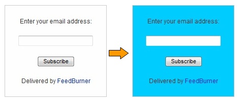
1. Add or Change Background Colour on FeedBurner Email Subscription Form

Add the background image code (e.g. background: url(http://www.example.com/image.jpg)) right after text-align:center;
So the code would be:-
<form style="border:1px solid #ccc;padding:3px;text-align:center;background: url(http://www.example.com/image.jpg);"
You can change the image URL to add your own.
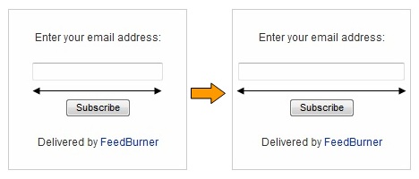
2. Change the Width and Height of the Text Box

Adjust the width of the text box width:140px to your requirements.
<input type="text" style="width:140px" name="email"/>
You can change with your desire width.
If you want to change the height of the text box, simply add height:20px right after width:140px and adjust the height to your requirements.
<input type="text" style="width:140px;height:20px;" name="email"/>
You can change with your desire height.
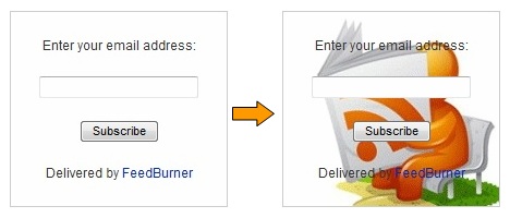
3. Add or Change Background Image on FeedBurner Email Subscription Form

Add the background image code (e.g. background: url(http://www.example.com/image.jpg)) right after text-align:center;
So the code would be:-
<form style="border:1px solid #ccc;padding:3px;text-align:center;background: url(http://www.example.com/image.jpg);"
You can change the image URL to add your own.
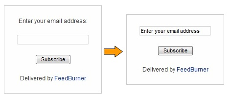
4. Add Default Text in the Text Box

You can add a default text in the text box to make it more attractive to the visitors.
Just remove the code below
<p>Enter your email address:</p><p><input type="text" style="width:140px" name="email"/></p>
and replace with
<p><input type="text" style="width:140px" name="email" onblur="if (this.value == '') {this.value = 'Enter your email address';}" onfocus="if (this.value == 'Enter your email address') {this.value = '';}" value="Enter your email address"/></p>
You can change with your desire default text.
How to Change Font Size and Font Colour of the Text
Add font-size:20px;color:#00CCFF right after width:140px
So the code would be:-
<input type="text" style="width:140px;font-size:20px;color:#00CCFF;" name="email"/>
You can change with your desire font size and font colour.
How to Remove “Delivered by Feedburner” Link
Just remove the following part from your code:
<p>Delivered by <a href="http://feedburner.google.com" target="_blank">FeedBurner</a></p>
That’s all. If you face any problem in Customize Feedburner Email Subscription Form. Feel free to contact me through your valuable comments!

You can also design your custom form and pass your feed url to action attributes.
I think thats easiest way to attract more and more subscribers.
Hi Ammar,
Your email subscription box looks good. How to create the one like that?
this is custom for my newsletter system and is not available for feedburner
Customizing subscription form in this way will definitely help bloggers in Increasing RSS Feed Subscribers of their blogs. Thanks.
all tips is known o me except background image is unknown to me.So it will help to customize my feed burner background image…Thanks buddy for this tips….
brilliant article. i am in the middle of this customization, but felt like writing a comment to tell you how great this article is.
Thank you for this helpful tutorial. How do I add a personal message below the subscribe button?
You can add personal message by editing default “Delivered by FeedBurner” Message :)
Actually, I have tried adding the details for font size and colour where you have said to and it doesn’t seem to be working… any ideas? Here is the code I’m using, if that helps:
Get all our updates, tips, advice and opinions delivered straight to your inbox:
Hi Jarratt,
I hope this will help you.
If not than send us code of your email subscription form :)
Forgive me, I see it is written above!
Hello,
This is a great article! Thanks, very helpful. One thing I would like to do is change the font size for the text above the box… but when I try to do that, it stuffs up the border by surrounding all text on the page with the border (not just the subscription box). Is there an easy way to do this, to make it stand out more? I’m new to HTML and learning as I go!
Is there any way that feedburner can notify me as soon as a new subscriber ops into my newsletter? Or do I have to go in an check every day to see if there are any new subscribers? I like to offer a free widget to people who sing in to my news letter. I would be nice to receive some kind of notification as soon as that happens.
Thank you so much for your blog about customizing feedburner.
There is no option to be notify when someone subscriber to your newsletter. You have to manually check subscribers. :)
Thanks for some great tips! I wonder if you have any experience styling a form that comes at the end of a post. I implemented the code, and what it did was stretch the form out, including both the “enter email” and “subscribe” fields. I’ve now styled it for colour, etc. but I can’t figure out how to resize the “subscribe” field (button). Any ideas?
Yes! We can customize any subscription form of your choice. All you need is to contact us (ammar@allbloggingtips.com)
Thanks for very clear instructions, before i implement, I want to ask regarding your fourth point. I don’t want to replace enter your e-mail, But i would like to add another Sentence on the line before, so how do I change the code to fit that? and would i need to increase the overall box size for that?
You can simple find this “Enter your email address” and replace it with your desire text! :D
Awesome share! This is the best tutorial I liked on this blog because an attractive subscription form plays a major role to attract more readers to convert them into subscribers!
awesome customization, thanks
I will Increase Feedburner Email subscribers by applying your great tips :P
Good luck Mani. Creating a cool subscription box will increase subscribers.
Simple is better. All of them looks good, but I would like to remove feedburner link and would never use an background image. Image increments HTTP request which is bad for site performance.
You are right Pardosh. But most peoples don’t like simple they need a professional one!