Blogger

Add Cute jQuery Popup For Facebook Like Box

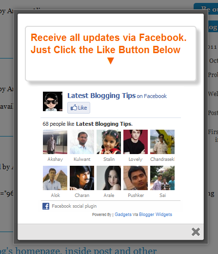
cute facebook popupAfter my recent widget Popup for Adsense. Now i decided to present some cool to you so I comes with a Cute jQuery Popup For Facebook Like Box. This is a great widget to increase likes. You may see on most sites or blogs which are using Popups to increase there subscribers, fans and followers. This Cute jQuery Popup For Facebook Like Box is a great widget for blogger. As soon as new visitors arrive your blog the popup will be showed to your visitors which can help you to increase likes and get more traffic from Facebook.In my next tutorials I will try  to make it more interactive with social media links, profiles and a complete version with everything in it which you may need.Check out demo below and than I show you How to Add Cute jQuery Popup For Facebook Like Box To Blogger or WordPress?

Live Demo


  • Add Cute jQuery Popup For Facebook Like Box To Blogger

I am discussing here steps for blogger but if you know how to deal simple HTML code then you can easily add it to your wordpress blog too.

  1. Go To Blogger > Design
  2. Click choose a gadget
  3. Select HTML/javascript widget
  4. Paste the following code inside it
  •  Add Cute jQuery Popup For Facebook Like Box To WordPress Blogs?

You can add  jQuery Facebook Like Box Popup To WordPress Blogs. Follow following steps to add this.

  1. Goto WordPress Dashboard > Appearance >Widget
  2. Drop a Text Widget to your sidebar.
  3. Now Paste above code in Text Widget.
  4. And CLick on save button. and see your blog
<style>

    /*
       ColorBox Core Style:
       The following CSS is consistent between example themes and should not be altered.
    */
    #colorbox, #cboxOverlay, #cboxWrapper{position:absolute; top:0; left:0; z-index:9999; overflow:hidden;}
    #cboxOverlay{position:fixed; width:100%; height:100%;}
    #cboxMiddleLeft, #cboxBottomLeft{clear:left;}
    #cboxContent{position:relative;}
    #cboxLoadedContent{overflow:auto;}
    #cboxTitle{margin:0;}
    #cboxLoadingOverlay, #cboxLoadingGraphic{position:absolute; top:0; left:0; width:100%;}
    #cboxPrevious, #cboxNext, #cboxClose, #cboxSlideshow{cursor:pointer;}
    .cboxPhoto{float:left; margin:auto; border:0; display:block;}
    .cboxIframe{width:100%; height:100%; display:block; border:0;}
    /*

       User Style:
       Change the following styles to modify the appearance of ColorBox.  They are
       ordered & tabbed in a way that represents the nesting of the generated HTML.
    */
    #cboxOverlay{background:#000;opacity:0.5 !important;}
    #colorbox{
            box-shadow:0 0 15px rgba(0,0,0,0.4);
           -moz-box-shadow:0 0 15px rgba(0,0,0,0.4);
            -webkit-box-shadow:0 0 15px rgba(0,0,0,0.4);
           }

    #cboxTopLeft{width:14px; height:14px; background:url(http://4.bp.blogspot.com/-_VSGGUcsUPE/TwNIXL6W2qI/AAAAAAAAFwQ/5KR8F-N3Mqk/s1600/controls.png) no-repeat 0 0;}
    #cboxTopCenter{height:14px; background:url(http://3.bp.blogspot.com/-dJQm3QEd5Iw/TxohpCter-I/AAAAAAAAF0Q/GRny7olLbv8/s400/border.png) repeat-x top left;}
         #cboxTopRight{width:14px; height:14px; background:url(http://4.bp.blogspot.com/-_VSGGUcsUPE/TwNIXL6W2qI/AAAAAAAAFwQ/5KR8F-N3Mqk/s1600/controls.png) no-repeat -36px 0;}
         #cboxBottomLeft{width:14px; height:43px; background:url(http://4.bp.blogspot.com/-_VSGGUcsUPE/TwNIXL6W2qI/AAAAAAAAFwQ/5KR8F-N3Mqk/s1600/controls.png) no-repeat 0 -32px;}
         #cboxBottomCenter{height:43px; background:url(http://3.bp.blogspot.com/-dJQm3QEd5Iw/TxohpCter-I/AAAAAAAAF0Q/GRny7olLbv8/s400/border.png) repeat-x bottom left;}
         #cboxBottomRight{width:14px; height:43px; background:url(http://4.bp.blogspot.com/-_VSGGUcsUPE/TwNIXL6W2qI/AAAAAAAAFwQ/5KR8F-N3Mqk/s1600/controls.png) no-repeat -36px -32px;}
         #cboxMiddleLeft{width:14px; background:url(http://4.bp.blogspot.com/-_VSGGUcsUPE/TwNIXL6W2qI/AAAAAAAAFwQ/5KR8F-N3Mqk/s1600/controls.png) repeat-y -175px 0;}
         #cboxMiddleRight{width:14px; background:url(http://4.bp.blogspot.com/-_VSGGUcsUPE/TwNIXL6W2qI/AAAAAAAAFwQ/5KR8F-N3Mqk/s1600/controls.png) repeat-y -211px 0;}
         #cboxContent{background:#fff; overflow:visible;}
             #cboxLoadedContent{margin-bottom:5px;}
             #cboxLoadingOverlay{background:url(http://2.bp.blogspot.com/-bMneOFi_UDo/Txohpge3Z9I/AAAAAAAAF0s/AbVgxX9pXtQ/s400/loadingbackground.png) no-repeat center center;}
             #cboxLoadingGraphic{http://3.bp.blogspot.com/-SKktU1-SCCw/TxohpRB19LI/AAAAAAAAF0Y/iwIo3LnjoE0/s400/loading.gif) no-repeat center center;}
             #cboxTitle{position:absolute; bottom:-25px; left:0; text-align:center; width:100%; font-weight:bold; color:#7C7C7C;}
             #cboxCurrent{position:absolute; bottom:-25px; left:58px; font-weight:bold; color:#7C7C7C;}
             #cboxPrevious, #cboxNext, #cboxClose, #cboxSlideshow{position:absolute; bottom:-29px; background:url(http://4.bp.blogspot.com/-_VSGGUcsUPE/TwNIXL6W2qI/AAAAAAAAFwQ/5KR8F-N3Mqk/s1600/controls.png) no-repeat 0px 0px; width:23px; height:23px; text-indent:-9999px;}
             #cboxPrevious{left:0px; background-position: -51px -25px;}
             #cboxPrevious.hover{background-position:-51px 0px;}
             #cboxNext{left:27px; background-position:-75px -25px;}
             #cboxNext.hover{background-position:-75px 0px;}
             #cboxClose{right:0; background-position:-100px -25px;}
             #cboxClose.hover{background-position:-100px 0px;}
             .cboxSlideshow_on #cboxSlideshow{background-position:-125px 0px; right:27px;}
             .cboxSlideshow_on #cboxSlideshow.hover{background-position:-150px 0px;}
             .cboxSlideshow_off #cboxSlideshow{background-position:-150px -25px; right:27px;}
             .cboxSlideshow_off #cboxSlideshow.hover{background-position:-125px 0px;}

    /*-----------------------------------------------------------------------------------*/
    /*   Facebook Likebox popup For Blogger
    /*-----------------------------------------------------------------------------------*/
    #subscribe {
        font: 12px/1.2 Arial,Helvetica,san-serif; color:#666;
    }
    #subscribe a,
    #subscribe a:hover,
    #subscribe a:visited {
        text-decoration:none;
    }
    .box-title {
       color: #F66303;
       font-size: 20px !important;
       font-weight: bold;
       margin: 10px 0;
    border:1px solid #ddd;
    -moz-border-radius:6px;
    -webkit-border-radius:6px;
    border-radius:6px;
    box-shadow: 5px 5px 5px #CCCCCC;
    padding:10px;
    line-height:25px; font-family:arial !important;
    }
    .box-tagline {
       color: #999;
       margin: 0;
       text-align: center;
    }
    #subs-container {
        padding: 35px 0 30px 0;
        position: relative;
    }
    a:link, a:visited {
    border:none;
    }
    .demo {
    display:none;
    }
    </style>

    <script src='https://ajax.googleapis.com/ajax/libs/jquery/1.6.1/jquery.min.js'></script>

    <script src="http://mybloggertricks.googlecode.com/files/jquery.colorbox-min.js"></script>
    <script type="text/javascript">
    jQuery(document).ready(function(){
       if (document.cookie.indexOf('visited=true') == -1) {
           var fifteenDays = 1000*60*60*24*30;
           var expires = new Date((new Date()).valueOf() + fifteenDays);
           document.cookie = "visited=true;expires=" + expires.toUTCString();
       $.colorbox({width:"400px", inline:true, href:"#subscribe"});
           }
    });
    </script>
        <!-- This contains the hidden content for inline calls -->

            <div style='display:none'>
       <div id='subscribe' style='padding:10px; background:#fff;'>
            <h3 class="box-title">Receive all updates via Facebook. Just Click the Like Button Below<center><p style="line-height:3px;" >▼</p></center></h3> 
          <center>

    <iframe src="//www.facebook.com/plugins/likebox.php?href=http%3A%2F%2Fwww.facebook.com%2Fallbloggingtips&amp;width=300&amp;colorscheme=light&amp;show_faces=true&amp;border_color=%23ffffff&amp;stream=false&amp;header=false&amp;height=258" scrolling="no" frameborder="0" style="border:none; overflow:hidden; width:300px; height:258px;" allowtransparency="true"></iframe>

    </center>

</div>
</div>

Visit your blog to see Facebook popup. To review the widget again and again just delete your browser cookies and refresh the page to see it appearing again. That’s it a cool Facebook pop up widget that will surly increase your facebook fan count.Thanks again to MBT for the original gadget.

Are you Want the widget to appear Repeatedly

If you want to prompt the likebox every time the visitor enters your blog then simply delete this *30 from the code above.


Stylish Pure CSS3 Multi Level Drop Down Menu For Blogger V2

I recently posts Pure CSS3 Multi Level Drop Down Menu For Blogger V1. I gets good response for this so I decided to release Pure CSS3 Multi Level Drop Down Menu V1. This Multi Level Drop Down Menu is modifed version of previous css3 menu. I had added some cool features to this menu. This menu is a Stylish Pure CSS3 Multi Level Drop Down Menu For Blogger. It is compatible for almost all browsers like Mozilla Firefox and Google Chrome etc but the rounded corners and shadow will not be rendered properly. I had made installation so easy you just need to copy and paste menu code in your blogger blog widget. This Menu  is provided by webDesignerWall guys and it is widgetized and made compatible with Blogspot blog platform by MBT.

See Also

Pure CSS3 Multi Level Drop Down Menu V2 Preview

stylish drop down menu v1

Live Demo

Add Pure CSS3 Multi Level Drop Down Menu V2 To Blogger

  1. Go To Blogger > Design
  2. Click on “Add a Gadget”
  3. Choose HTML/Javascript widget
  4. Paste the following code inside it


<style>
#ABT-Container {
    font: normal 1em Arial, Helvetica, sans-serif;
    background : #ddd; width:100%; float:left;   
}
a {
    color: #333;
}.example {
    background:#fff url(http://www.gowebbaby.com/wp-content/uploads/2011/12/website-designer.gif)center right  no-repeat;
    width:1200px;
    height:600px;
    border:1px #000 solid;
    margin:20px auto;
    padding:15px;
    border-radius:3px;
    -moz-border-radius:3px;
    -webkit-border-radius:3px;
}

#nav {
    margin: 0;
    padding: 7px 6px 0;
    background: #0080ff url(http://2.bp.blogspot.com/-A86MDTlHnVo/TtC-qF3gIQI/AAAAAAAAFbw/Vv41gIktCig/s1600/gradient.png) repeat-x 0 -110px;
    line-height: 100%;
    border-radius: 2em;
    -webkit-border-radius: 2em;
    -moz-border-radius: 2em;
    -webkit-box-shadow: 0 1px 3px rgba(0,0,0, .4);
    -moz-box-shadow: 0 1px 3px rgba(0,0,0, .4);
}
#nav li {
    margin: 0 5px;
    padding: 0 0 8px;
    float: left;
    position: relative;
    list-style: none; }

/* main level link */
#nav a {
    font-weight: bold;
    color: #e7e5e5;
    text-decoration: none;
    display: block;
    padding:  8px 20px;
    margin: 0;
    -webkit-border-radius: 1.6em;
    -moz-border-radius: 1.6em;
   
    text-shadow: 0 1px 1px rgba(0,0,0, .3);
}
#nav a:hover {
    background: #000;
    color: #fff;
}
/* main level link hover */
#nav .current a, #nav li:hover > a {
    background: #666 url(http://2.bp.blogspot.com/-A86MDTlHnVo/TtC-qF3gIQI/AAAAAAAAFbw/Vv41gIktCig/s1600/gradient.png) repeat-x 0 -40px;
    color: #444;
    border-top: solid 1px #f8f8f8;
    -webkit-box-shadow: 0 1px 1px rgba(0,0,0, .2);
    -moz-box-shadow: 0 1px 1px rgba(0,0,0, .2);
    box-shadow: 0 1px 1px rgba(0,0,0, .2);
    text-shadow: 0 1px 0 rgba(255,255,255, 1);
}
/* sub levels link hover */
#nav ul li:hover a, #nav li:hover li a {
    background: none;
    border: none;
    color: #666;
    -webkit-box-shadow: none;
    -moz-box-shadow: none;
}
#nav ul a:hover {
    background: #0080ff url(http://2.bp.blogspot.com/-A86MDTlHnVo/TtC-qF3gIQI/AAAAAAAAFbw/Vv41gIktCig/s1600/gradient.png) repeat-x 0 -100px !important;
    color: #fff !important;
text-align:left;
    -webkit-border-radius: 0;
    -moz-border-radius: 0;
    text-shadow: 0 1px 1px rgba(0,0,0, .1);
}
/* dropdown */
#nav li:hover > ul {
    display: block;
}
/* level 2 list */
#nav ul {
    display: none;
text-align:left;
    margin: 0;
    padding: 0;
    width: 185px;
    position: absolute;
    top: 35px;
    left: 0;
    background: #ddd url(http://2.bp.blogspot.com/-A86MDTlHnVo/TtC-qF3gIQI/AAAAAAAAFbw/Vv41gIktCig/s1600/gradient.png) repeat-x 0 0;
    border: solid 1px #b4b4b4;
    -webkit-border-radius: 10px;
    -moz-border-radius: 10px;
    border-radius: 10px;
    -webkit-box-shadow: 0 1px 3px rgba(0,0,0, .3);
    -moz-box-shadow: 0 1px 3px rgba(0,0,0, .3);
    box-shadow: 0 1px 3px rgba(0,0,0, .3);
}
#nav ul li {
    float: none;
    margin: 0;
    padding: 0;
}
#nav ul a {
    font-weight: normal;
    text-shadow: 0 1px 0 #fff;
}
/* level 3+ list */
#nav ul ul {
    left: 181px;
    top: -3px;
}
/* rounded corners of first and last link */
#nav ul li:first-child > a {
    -webkit-border-top-left-radius: 9px;
    -moz-border-radius-topleft: 9px;
    -webkit-border-top-right-radius: 9px;
    -moz-border-radius-topright: 9px;
}
#nav ul li:last-child > a {
    -webkit-border-bottom-left-radius: 9px;
    -moz-border-radius-bottomleft: 9px;
    -webkit-border-bottom-right-radius: 9px;
    -moz-border-radius-bottomright: 9px;
}
/* clearfix */
#nav:after {
    content: ".";
    display: block;
    clear: both;
    visibility: hidden;
    line-height: 0;
    height: 0;
}
#nav {
    display: inline-block;
}
</style>

<div id="ABT-Container">
<ul id="nav">
<li><a href="#">Home</a></li>
<li><a href="#">All Blogging Tips</a>
<ul>
<li><a href="#">Sub-Row</a>
<ul>
<li><a href="#">Sub Sub-Row 1
<li><a href="#">Sub Sub-Row 1</a></li>
</a></li></ul>
</li>
<li><a href="#">Sub-Row</a>
<ul>
               
<li><a href="#">Sub Sub-Row 2</a></li>
</ul>
</li>
<li><a href="#">Sub-Row</a></li>
</ul>
</li>

<li><a href="#">Multi-Levels</a>
<ul>
<li><a href="#">Team</a>
<ul>
<li><a href="#">Sub-Level Item 1</a></li>
<li><a href="#">Sub-Level Item 1</a>
<ul>
<li><a href="#">Sub-Level Item 11</a></li>
<li><a href="#">Sub-Level Item 22</a></li>
<li><a href="#">Sub-Level Item 33</a></li>
</ul>
</li>
                   
<li><a href="#">Sub-Level Item 1</a></li>
</ul>
</li>
<li><a href="#">Sales</a></li>
<li><a href="#">Another Link</a></li>
<li><a href="#">Department</a>
<ul>
<li><a href="#">Sub-Level Item 2</a></li>
</ul>
</li>
</ul>
</li><li><a href="#">Sitemap</a></li>   
<li><a href="#">Services</a></li>
<li><a href="#">Contact Us</a></li>
<li><a href="#">About Us</a></li>
<li><a href="https://allbloggingtips.com/2012/01/28/pure-css3-multi-level-drop-down-menu-v2">Create This »</a></li>

</ul></div>
<br/>

The best part about this Multi Level Drop Down Menu is that you can give it any colour you want because here we are using a transparent gradient image which can take any colour you want. Like:

Transperent ExapmleNow kindly make these customization changes to add your own links to menu:
  • Each TAB can be edited by directly understanding the following HTML code,

<li><a href=”#“>TAB TEXT</a></li>

In each case replace the hash sign (#) with your page URL or link and replace the text with your page title. I have kept the page titles unchanged in the code above so that you could easily edit them by seeing the demo.

Confused or Need Help?

If you need some extra help in removing rows or columns then please feel free to post your questions. You can discus it as much with me as possible. This will help others to better understand on how to make further changes. :D

Add Stylish Floating Facebook Like Box Widget In Blogger

This widget is not working anymore, Please visit Stylish Floating Like Box for Blogger Updated.

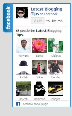
floating facebook likeboxI found this great Floating Facebook Like Box Widget on internet. This will Floating Facebook Button when to move your cursor on it it pop out with stylish floating facebook like box. This is a great widget for blogger. Which will help you to increase facebook likes. You just need to put Jquery and CSS . HTML code to your blogger blog. I will soon share more floating widgets like Google+, Twitter Follower Box and Floating Subscription box in future. Now lets move to how you can add this in blogger I will show you How You Can Add Stylish Floating Facebook Like Box Widget In Blogger.

Updated Widget!


How To Add Stylish Floating Facebook Like Box Widget In Blogger

  1. Go To Blogger>>>Design>>>Edit HTML
  2. Tick Expand Widget Template
  3. Search For The Tag </head> (Using ctrl + f )
  4. Copy n Paste Below Code Before </head>
<link href=’https://gj37765.googlecode.com/svn/trunk/[www.gj37765.blogspot.com]multipopoutwidget.css’ rel=’stylesheet’/>
<script src=‘http://ajax.googleapis.com/ajax/libs/jquery/1.4.2/jquery.min.js‘ type=’text/javascript’/>
<script src=’http://apis.google.com/js/plusone.js’ type=’text/javascript’/>
<script type=’text/javascript’>
jQuery(document).ready(function(){
jQuery(&quot;#facebook_right&quot;).hover(function(){ jQuery(this).stop(true,false).animate({right:  0}, 500); },function(){ jQuery(&quot;#facebook_right&quot;).stop(true,false).animate({right: -200}, 500); });    jQuery(&quot;#twitter_right&quot;).hover(function(){ jQuery(this).stop(true,false).animate({right:  0}, 500); },function(){ jQuery(&quot;#twitter_right&quot;).stop(true,false).animate({right: -250}, 500); });     jQuery(&quot;#google_plus_right&quot;).hover(function(){ jQuery(this).stop(true,false).animate({right:  0}, 500); },function(){ jQuery(&quot;#google_plus_right&quot;).stop(true,false).animate({right: -154}, 500); });    jQuery(&quot;#feedburner_right&quot;).hover(function(){ jQuery(this).stop(true,false).animate({right:  0}, 500); },function(){ jQuery(&quot;#feedburner_right&quot;).stop(true,false).animate({right: -303}, 500); });    });
</script>
Note :– CTRL + F To Find Above Red jQuery Plugin URL In Your Template If You Have Already This Plugin Than Remove It .

5. Now Save Your Template

Now Adding HTML Code It’s Simple

  1. Go to Blogger>>Design>>>Add a Gadget
  2. Choose HTML/Javascript
  3. Copy n paste below HTML code Into It,
<div id=”on”>
<div id=”facebook_right” style=”top: 18%;”>
<div id=”facebook_div”>
<img src=”http://1.bp.blogspot.com/-XyYjgghpO7A/TwqccHW47QI/AAAAAAAACSU/OvETkV56ui8/s1600/%255Bwww.gj37765.blogspot.com%255Dfacebook_right.png” alt=”” /><iframe src=”http://www.facebook.com/plugins/likebox.php?href=http%3A%2F%2Ffacebook.com/allbloggingtips&amp;locale=en_GB&amp;width=200&amp;connections=9&amp;stream=&amp;header=false&amp;show_faces=0&amp;height=356″   scrolling=”no”></iframe>
</div>
</div>
</div>
Note:- Replace allbloggingtips With Your Facebook User name

5.Now Click on Save Widget.

This widget is not working anymore, Please visit Stylish Floating Like Box for Blogger Updated.

Visit your Blogs to see it floating at the right side of your webpage. I hope this widget helps you in increasing the number of your Facebook Readers. That’s all. If you face any problem in floating facebook like box or any problem than don’t stop just drop your comments and Feel free to ask.

HEX Color Code Generator Tool

The  color code generator tool below will help you get the six digit color code i.e hexadecimal value. These tools will help you a lot in customizing your Blogger templates, WordPRess themes and for other color purposes  and for writing more appealing posts. Kindly Follow the instructions for each tool before using it.

Hex Color Code Generator Tool

Instructions:

  1. First drag the bar on the “Hue” selector to the area of your desired colour palate.
  2. Then click inside the Brightness/Saturation area and drag the cursor until you have achieved your desired colour. The “Swatch” bar shows you the final colour result.
  3. The hexadecimal colour code is generated in the “Hex” box. Simply copy the six digit code i.e #000000
  4. That’s it!


Pure CSS3 Multi Level Drop Down Menu For Blogger V1

I recently posted Add Smooth Multi Level Drop-Down Menu In Blogger. But this is simple, smooth not just a perfect good looking Stylish Pure CSS3 Multi Level Drop Down Menu. Now I comes with Stylish Pure CSS3 Multi Level Drop Down Menu For Blogger. This menu is purely designed with CSS3 and No Images, No javascript is included in it. It is compatible for almost all browsers like Mozilla Firefox and Google Chrome etc but the rounded corners and shadow will not be rendered properly. This menu is provided by webDesignerWall. I have made installation method very easy you just need to copy and paste the code to where you want Multi Level Drop Down Menu to appear.

Pure CSS3 Multi Level Drop Down Menu Preview

stylish drop down menu v1

Live Demo

Add Multi Level Drop Down Menu To Blogger

  1. Go To Blogger > Design
  2. Click on “Add a Gadget”
  3. Choose HTML/Javascript widget
  4. Paste the following code inside it
<style>
#ABT-Container  {
    font: normal .8em/1.5em Arial, Helvetica, sans-serif;
    background: #ebebeb;
     width:100%; float:left;    
}

a {
    color: #333;
}
#nav {
    margin: 0;
    padding: 7px 6px 0;
    line-height: 100%;
    border-radius: 2em;

    -webkit-border-radius: 2em;
    -moz-border-radius: 2em;
    
    -webkit-box-shadow: 0 1px 3px rgba(0, 0, 0, .4);
    -moz-box-shadow: 0 1px 3px rgba(0, 0, 0, .4);

    background: #8b8b8b; /* for non-css3 browsers */
    filter:  progid:DXImageTransform.Microsoft.gradient(startColorstr='#a9a9a9', endColorstr='#7a7a7a'); /* for IE */
    background: -webkit-gradient(linear, left top, left bottom, from(#a9a9a9), to(#7a7a7a)); /* for webkit browsers */
    background: -moz-linear-gradient(top,  #a9a9a9,  #7a7a7a); /* for firefox 3.6+ */

    border: solid 1px #6d6d6d;
}
#nav li {
    margin: 0 5px;
    padding: 0 0 8px;
    float: left;
    position: relative;
    list-style: none;
}
/* main level link */
#nav a {
    font-weight: bold;
    color: #e7e5e5;
    text-decoration: none;
    display: block;
    padding:  8px 20px;
    margin: 0;
    -webkit-border-radius: 1.6em;
    -moz-border-radius: 1.6em;
    text-shadow: 0 1px 1px rgba(0, 0, 0, .3);
}
/* main level link hover */
#nav .current a, #nav li:hover > a {
    background: #d1d1d1; /* for non-css3 browsers */
    filter:  progid:DXImageTransform.Microsoft.gradient(startColorstr='#ebebeb', endColorstr='#a1a1a1'); /* for IE */
    background: -webkit-gradient(linear, left top, left bottom, from(#ebebeb), to(#a1a1a1)); /* for webkit browsers */
    background: -moz-linear-gradient(top,  #ebebeb,  #a1a1a1); /* for firefox 3.6+ */

    color: #444;
    border-top: solid 1px #f8f8f8;
    -webkit-box-shadow: 0 1px 1px rgba(0, 0, 0, .2);
    -moz-box-shadow: 0 1px 1px rgba(0, 0, 0, .2);
    box-shadow: 0 1px 1px rgba(0, 0, 0, .2);
    text-shadow: 0 1px 0 rgba(255, 255, 255, .8);
}
/* sub levels link hover */
#nav ul li:hover a, #nav li:hover li a {
    background: none;
    border: none;
    color: #666;
    -webkit-box-shadow: none;
    -moz-box-shadow: none;
}
#nav ul a:hover {
    background: #0399d4 !important; /* for non-css3 browsers */
    filter:  progid:DXImageTransform.Microsoft.gradient(startColorstr='#04acec', endColorstr='#0186ba'); /* for IE */
    background: -webkit-gradient(linear, left top, left bottom, from(#04acec), to(#0186ba)) !important; /* for webkit browsers */
    background: -moz-linear-gradient(top,  #04acec,  #0186ba) !important; /* for firefox 3.6+ */

    color: #fff !important;
    -webkit-border-radius: 0;
    -moz-border-radius: 0;
    text-shadow: 0 1px 1px rgba(0, 0, 0, .1);
}
/* level 2 list */
#nav ul {
    background: #ddd; /* for non-css3 browsers */
    filter:  progid:DXImageTransform.Microsoft.gradient(startColorstr='#ffffff', endColorstr='#cfcfcf'); /* for IE */
    background: -webkit-gradient(linear, left top, left bottom, from(#fff), to(#cfcfcf)); /* for webkit browsers */
    background: -moz-linear-gradient(top,  #fff,  #cfcfcf); /* for firefox 3.6+ */

    display: none;
    margin: 0;
    padding: 0;
    width: 185px;
    position: absolute;
    top: 35px;
    left: 0;
    border: solid 1px #b4b4b4;
    -webkit-border-radius: 10px;
    -moz-border-radius: 10px;
    border-radius: 10px;
    -webkit-box-shadow: 0 1px 3px rgba(0, 0, 0, .3);
    -moz-box-shadow: 0 1px 3px rgba(0, 0, 0, .3);
    box-shadow: 0 1px 3px rgba(0, 0, 0, .3);
}
/* dropdown */
#nav li:hover > ul {
    display: block;
}
#nav ul li {
    float: none;
    margin: 0;
    padding: 0;
}
#nav ul a {
    font-weight: normal;
    text-shadow: 0 1px 1px rgba(255, 255, 255, .9);
}
/* level 3+ list */
#nav ul ul {
    left: 181px;
    top: -3px;
}
/* rounded corners for first and last child */
#nav ul li:first-child > a {
    -webkit-border-top-left-radius: 9px;
    -moz-border-radius-topleft: 9px;
    -webkit-border-top-right-radius: 9px;
    -moz-border-radius-topright: 9px;
}
#nav ul li:last-child > a {
    -webkit-border-bottom-left-radius: 9px;
    -moz-border-radius-bottomleft: 9px;
    -webkit-border-bottom-right-radius: 9px;
    -moz-border-radius-bottomright: 9px;
}
/* clearfix */
#nav:after {
    content: ".";
    display: block;
    clear: both;
    visibility: hidden;
    line-height: 0;
    height: 0;
}
#nav {
    display: inline-block;
}
html[xmlns] #nav {
    display: block;
}
* html #nav {
    height: 1%;
}
</style>

<div id="ABT-Container">
<ul id="nav"><li><a href="#">Home</a></li>
<li><a href="#">Technology Tricks</a>
<ul>
<li><a href="#">Sub-Row</a>
<ul>
<li><a href="#">Sub Sub-Row 1</a></li>
</a></li></ul>
</li>
<li><a href="#">Sub-Row</a>
<ul>
               
<li><a href="#">Sub Sub-Row 2</a></li>
</ul>
</li>
<li><a href="#">Sub-Row</a></li>
</ul>
</li>

<li><a href="#">Multi-Levels</a>
<ul>
<li><a href="#">Team</a>
<ul>
<li><a href="#">Sub-Level Item 1</a></li>
<li><a href="#">Sub-Level Item 1</a>
<ul>
<li><a href="#">Sub-Level Item 11</a></li>
<li><a href="#">Sub-Level Item 22</a></li>
<li><a href="#">Sub-Level Item 33</a></li>
</ul>
</li>
                   
<li><a href="#">Sub-Level Item 1</a></li>
</ul>
</li>
<li><a href="#">Sales</a></li>
<li><a href="#">Another Link</a></li>
<li><a href="#">Department</a>
<ul>
<li><a href="#">Sub-Level Item 2</a></li>
</ul>
</li>
</ul>
</li><li><a href="#">Home</a></li>   
<li><a href="#">About Me</a></li>
<li><a href="#">Contact Me</a></li>
<li><a href="#">Blogger Tutorials</a></li>


</ul>
</div>

The best part about this Multi Level Drop Down Menu is that you can give it any colour you want because here we are using a transparent gradient image which can take any colour you want. Like:

Transperent ExapmleNow kindly make these customization changes to add your own links to menu:

  • Each TAB can be edited by directly understanding the following  HTML code,

<li><a href=”#“>TAB TEXT</a></li>

In each case replace the hash sign (#) with your page URL or link and replace the text with your page title. I have kept the page titles unchanged in the code above so that you could easily edit them by seeing the demo.

This is V1 of Multi Level Drop Down Menu. I will soon publish another article on this cool Multi Level Drop Down Menu. Till than stay tune!

Confused or Need Help?

If you need some extra help in removing rows or columns then please feel free to post your questions. You can discus it as much with me as possible. This will help others to better understand on how to make further changes. :D