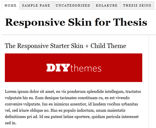
 Finally, DIY Themes officially announced that now we can easily make thesis theme responsive with “Responsive Skin + Child Theme Starter Set” for Thesis Theme. All this work is done by Alex “the kid” Mangini. ;)
The starter kit is free. Here are thing which you need to make thesis theme responsive.
- Thesis Theme Framework (If you don’t have!)
- Responsive Child Theme for Thesis
- Responsive Starter Skin Set for Thesis
Some of you may be confused what is responsive design? Well, below I am writing a short info about what is responsive design!
What is responsive design?
Responsive design is, the design that will automatically adjust your website/blog/ based on width of device. You can say In the simple words, your blog will work perfectly on all the mobiles/smartphones/tablets without any mobile version WP plugin.

Now without wasting anytime. Let move on How to Make Thesis Theme Responsive ?
How to Make Thesis Theme Responsive ?
Below I am mentioning 2 simple ways you can do to make thesis theme responsive! If you are confused at any step just leave comment below :D
- Manual Method.
Just download the thesis starter set and delete the current “ custom_functions.php ” and “ custom.css ” files (remember to keep the backup of both the files in case if something went wrong ), then upload the custom_functions.php and custom.css files that you download recently from this link :) .
- By Installing child theme easily !!
If you don’t want to manually upload the files, you can also use a child theme, instead. That won’t take much efforts from your side but it will only work with the fresh installations.
If you face any problem in installing that you are most welcome to ask any question in below comments. I will help you for sure :D


 Recently we shared simple yet
