• Skip to primary navigation
  • Skip to main content
  • Skip to primary sidebar
  • Skip to footer
logo

All Blogging Tips

Everything About Blogging

  • Home
  • Start a Blog
  • Grow Your Blog
  • About
  • Contact
  • Privacy Policy
  • Tools I Use

HOW TO: Increase Traffic To Your Photography Blog

By Paul Santosh 11 Comments

So, you have a photography blog and you’ve been posting pictures for a long time and you’re still not getting enough traffic. The same happened to my friend. Traffic means a lot especially for blogs. It’s easy to manage a photo blog, but when it comes to traffic it may be difficult to get it. In this article I’m gonna show you how to increase traffic to your photo blog making the best use of the social networking sites.

Photography

1. Use Watermarks while sharing your pictures

One of the best way to increase traffic to your photo blog is to share your pictures with your blog URL watermark or use some text like this on the image – “For Full Size Visit This Website – [YOURBLOG].com”. You small size pictures while sharing, and tell them to visit your site for the full size images.

2. Join Photography groups on Facebook

There are many groups on Facebook for photographers, you can find them in the search bar in the Facebook homepage, then there you’ll find some posting there, send a friend request to anyone of them, and then, after he accepts the request, tell him to add you to the group. And then post your images(which should have watermarks). And then wait for a few days, you’ll see the increase traffic to your blog!

3. Pin your Images

Pinterest is the largest growing social networking site. You can drive large amounts of traffic from Pinterest, if you have good amount of followers. You may google it to find tips and tricks about how to increase followers and repins. Here are a few tips to get more followers –

  • Keep pinning regularly
  • Don’t pin only your (blog’s) images, but also keep pinning other awesome pics.
  • Comment on others images to gain exposure
  • Follow as many as you can, so that you’ll gain exposure, since they’ll see you in their notifications and may follow you back!

4. Add your images in Flickr

As you know, Flickr is one of the largest image sharing sites. Add some images in Flickr with a watermark text(make sure your blog URL, is in the watermark text.)

5. Optimize your images for search engines

SEO is the best way to increase traffic for any kinda blog. This is the same for photo blogs too. Here are few tips to optimize your images for search engines –

  1. Use keyword in file name

For example, let us think you’ve bought a new Mercedes, and you want to post that image in your photo blog, then the image with file name my-new-mercedes.jpg would get a better ranking in search engines than IMG00010.jpg
So, it’s better to use a keyword in a file name, to get a better ranking.

  2. Descriptive Alt Tags

The alt attribute describes the contents of an image file.(You can read about the importance of alt attribute in the image publishing guidelines). An image with alt attribute is market up as follows –

<img src="my-new-mercedes" alt="My New Mercedes" />

  3. SEO Friendly Images WordPress Plugin

SEO Friendly Images is a WordPress Plugin which automatically updates all images with proper alt and title attributes. It makes your SEO for images easy. Read more about this plugin here – http://wordpress.org/extend/plugins/seo-image/

You can read more about optimizing images for SEO here – http://support.google.com/webmasters/bin/answer.py?hl=en&answer=114016&ctx=sibling

Some website which increase your photo blog’s exposure –

  • Cool PhotoBlogs
  • Photo Friday.

Hope you find this article useful :)

Elegant Style Drop Down Menu With Hover Effect

By Ammar Ali 16 Comments

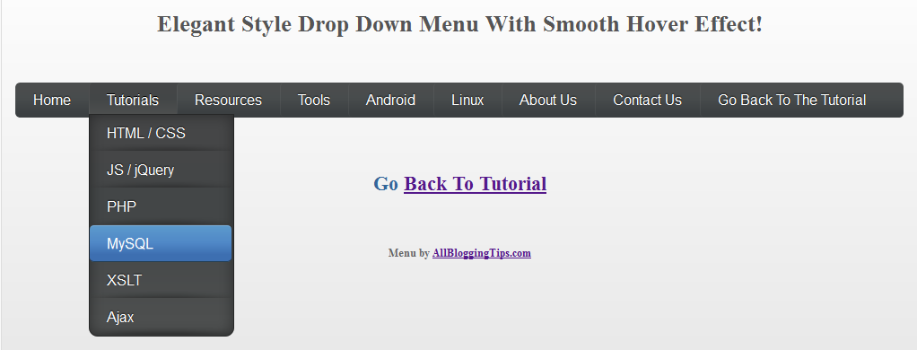
elegant style menu small iconWe already shared many drop down menus and now its time for Elegant Style Drop Down menu with smooth hover effect. This drop down menu use Css3, HTML. No Images no jquery.  It is compatible for almost all browsers like Mozilla Firefox and Google Chrome etc but the rounded corners and shadow will not be rendered properly. So without wasting anytime lets move on to create Elegant Style Drop Down Menu With Smooth Hover Effect for Blogger or WordPress..

Before we continue have a look at our other drop down menus.

  • Mac Style Menu with Search Box
  • Another CSS3 Menu V3
  • Css3 Pure Menu V2 For Blogger
  • Css3 Drop Down Menu For Blogger V1
  • Smooth Multi Level Drop Down Menu for Blogger

Elegant Style Drop Down Menu With Hover Effect Preview

elegant style drop down menu

Live Demo

The CSS

Below is the css of menu. You can add it to your main site css file. Like If you are using WordPress than paste CSS below in your style.css file and If you are using Blogger/Blogspot than go to Design>Edit HTML and place CSS give below just before  ]]></b:skin>


/* main and secondary top-level navigations */
#nav {
float: left;
font-family: 'Oswald', sans-serif;
-webkit-border-radius: 5px;
-moz-border-radius: 5px;
border-radius: 5px;
overflow: hidden;
width: 100%;
}

#nav ul {
margin:0;
padding:0;
list-style:none;

}

#nav ul li { -webkit-border-radius: 5px;
-moz-border-radius: 5px;
border-radius: 5px;
float:left; 

    background: url(http://4.bp.blogspot.com/-ZQjMkefe9n4/T8xGVbAMgyI/AAAAAAAAAoQ/H9ngLuwgkcc/s320/menu-link-bg.png) bottom center no-repeat;
}

#nav ul li a { 

  width: 100%;
       float: left;
    color:#fff;
    padding: 10px 19px;
    text-decoration:none;

  background:#3C4042;
     background: -webkit-gradient( linear, left bottom, left top, color-stop(0.09, rgb(59,63,65)), color-stop(0.55, rgb(72,76,77)), color-stop(0.78, rgb(75,77,77)) );
    background: -moz-linear-gradient( center bottom, rgb(59,63,65) 9%, rgb(72,76,77) 55%, rgb(75,77,77) 78% );
    background: -o-linear-gradient( center bottom, rgb(59,63,65) 9%, rgb(72,76,77) 55%, rgb(75,77,77) 78% );
    border-left: 1px solid rgba(255, 255, 255, 0.05);
        border-right: 1px solid rgba(0,0,0,0.2);
     text-shadow: 0 -1px 1px rgba(0, 0, 0, 0.6);

     -webkit-border-radius: 5px;
-moz-border-radius: 5px;
border-radius: 5px;

}

#nav ul li a:hover,
#nav ul li:hover > a {
        color: #fff;
        background:#3C4042;
    background: -webkit-gradient( linear, left bottom, left top, color-stop(0.09, rgb(77,79,79)), color-stop(0.55, rgb(67,70,71)), color-stop(0.78, rgb(69,70,71)) );
    background: -moz-linear-gradient( center bottom, rgb(77,79,79) 9%, rgb(67,70,71) 55%, rgb(69,70,71) 78% );
    background: -o-linear-gradient( center bottom, rgb(77,79,79) 9%, rgb(67,70,71) 55%, rgb(69,70,71) 78% );
        text-shadow: 0 1px 0 rgba(255, 255, 255, 0.2), 0 -1px #000;

}

#nav li ul a:hover,
#nav ul li li:hover > a  {
    color: #fff;
      background: #5C9ACD;
    background: -webkit-gradient( linear, left bottom, left top, color-stop(0.17, rgb(61,111,177)), color-stop(0.51, rgb(80,136,199)), color-stop(1, rgb(92,154,205)) );
    background: -moz-linear-gradient( center bottom, rgb(61,111,177) 17%, rgb(80,136,199) 51%, rgb(92,154,205) 100% );
    background: -o-linear-gradient( center bottom, rgb(61,111,177) 17%, rgb(80,136,199) 51%, rgb(92,154,205) 100% );
        border-bottom: 1px solid rgba(0,0,0,0.6);
        border-top: 1px solid #7BAED9;
        text-shadow: 0 1px rgba(255, 255, 255, 0.3);
}

#nav li ul {

        background:#3C4042;
        background-image: -webkit-gradient( linear, left bottom, left top, color-stop(0.09, rgb(77,79,79)), color-stop(0.55, rgb(67,70,71)), color-stop(0.78, rgb(69,70,71)) );
        background-image: -moz-linear-gradient( center bottom, rgb(77,79,79) 9%, rgb(67,70,71) 55%, rgb(69,70,71) 78% );
        background-image: -o-linear-gradient( center bottom, rgb(77,79,79) 9%, rgb(67,70,71) 55%, rgb(69,70,71) 78% );
        border-radius: 0 0 10px 10px;
        -moz-border-radius: 0 0 10px 10px;
        -webkit-border-radius: 0 0 10px 10px;
        left: -999em;
        margin: 35px 0 0;
        position: absolute;
        width: 160px;
        z-index: 9999;
        box-shadow: 0 0 15px rgba(0, 0, 0, 0.4) inset;
        -moz-box-shadow: 0 0 15px rgba(0, 0, 0, 0.4) inset;
        -webkit-box-shadow: 0 0 15px rgba(0, 0, 0, 0.4) inset;
        border: 1px solid rgba(0, 0, 0, 0.5);
}

#nav li:hover ul {
        left: auto;
}

#nav li ul a {
        background: none;
        border: 0 none;
        margin-right: 0;
        width: 120px;
        box-shadow: none;
        -moz-box-shadow: none;
        -webkit-box-shadow: none;
        border-bottom: 1px solid transparent;
        border-top: 1px solid transparent;
}

#nav li li ul {
        margin: -1px 0 0 160px;
        -webkit-border-radius: 0 6px 6px 6px;
        -moz-border-radius: 0 6px 7px 6px;
        border-radius: 0 6px 6px 6px;
        visibility:hidden;
}

#nav li li:hover ul {
        visibility:visible;
}

#nav ul ul li:last-child > a {

    -moz-border-radius:0 0 6px 6px;
    -webkit-border-radius:0 0 6px 6px;
    border-radius:0 0 6px 6px;

}

#nav ul ul ul li:first-child > a {
    -moz-border-radius:0 6px 0 0;
    -webkit-border-radius:0 6px 0 0;
    border-radius:0 6px 0 0;
}


The HTML

You can add this HTML code in any place of your site/blog. If you are using WordPress than add below HTML code in your header.php file and If you are using Blogspot than add below code in header gadget (widget)  ;)

<div id="nav">
<ul>

<li><a href="http://www.allbloggingtips.com/">Home</a></li>

 <li><a href="#">Tutorials</a>
            <ul>
                <li><a href="#">HTML / CSS</a></li>
                <li><a href="#">JS / jQuery</a>
                    <ul>
                        <li><a href="#">jQuery</a></li>
                        <li><a href="#">JS</a></li>
                    </ul>
                </li>
                <li><a href="#">PHP</a></li>
                <li><a href="#">MySQL</a></li>
                <li><a href="#">XSLT</a></li>
                <li><a href="#">Ajax</a></li>
            </ul>
        </li>
        <li><a href="#">Resources</a>
            <ul>
                <li><a href="#">By category</a>
                    <ul>
                        <li><a href="#">PHP</a></li>
                        <li><a href="#">MySQL</a></li>
                        <li><a href="#">XSLT</a></li>
                        <li><a href="#">Ajax</a></li>
                    </ul>
                </li>
                <li><a href="#">By tag name</a>
                    <ul>
                        <li><a href="#">captcha</a></li>
                        <li><a href="#">gallery</a></li>
                        <li><a href="#">animation</a></li>
                    </ul>
                </li>
            </ul>
        </li>

   <li><a href="#">Tools</a></li>
<li><a href="#">Android</a>
<ul>
<li><a href="#">Android Apps</a></li>
<li><a href="#">Android Games</a></li>
</ul>
</li>

<li><a href="#">Linux</a>
<ul>
<li><a href="#">RedHat</a></li>
<li><a href="#">CentOS</a></li>
<li><a href="#">Fedora</a></li>
<li><a href="#">Ubuntu</a></li>
<li><a href="#">Debian</a></li>
<li><a href="#">Linux Mint</a></li>
</ul>
</li>     

                  <li><a href="#">About</a></li>

<li><a href="#">Contact</a></li>

        <li><a href="#">Back To Tutorial </a></li>

</ul>
</div>


Confused or Need Help?

If you need some extra help in removing rows or columns then please feel free to post your questions. You can discus it as much with me as possible. This will help others to better understand on how to make further changes.

Credits: This Elegant Style Drop Down Menu With Smooth Hover Effect is first shared on AllBloggingTips. Bloggers are requested to link back if they are going to share above menu with there visitors.

How to Add Cool Floating Notification bar in Blogger

By Ammar Ali 6 Comments

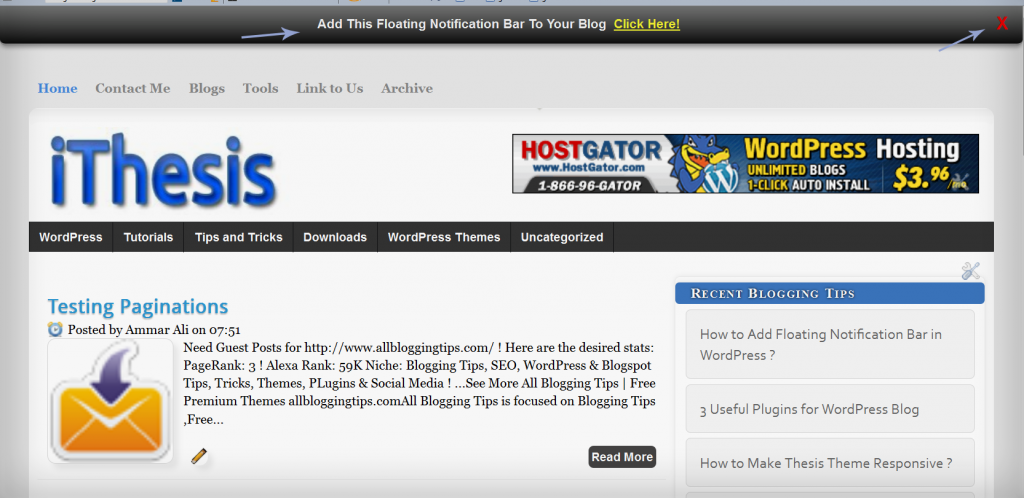
We already shared a floating notification bar for wordpress recently. Many of my readers request to create this floating notification bar for Blogspot/Blogger blogs and today we are sharing a simple yet Cool Floating Notification bar for Blogger. Its very easy to add this widget in blogspot. All you have to do is copy code given below, paste it in to your blog and customize text, link etc according to your needs. Isn’t that simple! :D

Blogger floating notification bar copynotification

Live Demo

Add Cool Floating Notification bar in Blogger !

First  Always Back Up Your Template Before You Any Make Changes – How To Back Up A Blogger Template

  • Goto Blogger  => Design => Edit HTML
  • Next search for this code
<body>
  •   Just below it paste the following code,
<!-- Notification code start -->
<style type='text/css'>
#ut-sticky
{
background: #7d7e7d; /* Old browsers */
background: -moz-linear-gradient(top,  #7d7e7d 6%, #7d7e7d 9%, #0e0e0e 99%); /* FF3.6+ */
background: -webkit-gradient(linear, left top, left bottom, color-stop(6%,#7d7e7d), color-stop(9%,#7d7e7d), color-stop(99%,#0e0e0e)); /* Chrome,Safari4+ */
background: -webkit-linear-gradient(top,  #7d7e7d 6%,#7d7e7d 9%,#0e0e0e 99%); /* Chrome10+,Safari5.1+ */
background: -o-linear-gradient(top,  #7d7e7d 6%,#7d7e7d 9%,#0e0e0e 99%); /* Opera 11.10+ */
background: -ms-linear-gradient(top,  #7d7e7d 6%,#7d7e7d 9%,#0e0e0e 99%); /* IE10+ */
background: linear-gradient(top,  #7d7e7d 6%,#7d7e7d 9%,#0e0e0e 99%); /* W3C */
filter: progid:DXImageTransform.Microsoft.gradient( startColorstr=&#39;#7d7e7d&#39;, endColorstr=&#39;#0e0e0e&#39;,GradientType=0 ); /* IE6-9 */

border-bottom:2px solid #999;

color:#fff;
text-align: center;
margin:-12px auto;
padding-bottom:1px;
border-top: 1px solid #333;
height:38px;
font-size:13px;
position:fixed;
vertical-align: baseline; overflow:hidden;
z-index:999;
width:100%;
border-bottom-left-radius:6px;
border-bottom-right-radius:6px;
display:block;
font-weight: bold;
font-family: arial,&quot;Helvetica&quot;;
font-color:#fff;
 -moz-box-shadow: 0 2px 4px hsla(0,0%,0%,.35);
 -webkit-box-shadow: 0 2px 4px hsla(0,0%,0%,.35);
}
#ut-sticky:hover
{

background-color:#333;background-image:-moz-linear-gradient(top,#555555,#434343);background-image:-ms-linear-gradient(top,#555555,#434343);background-image:-webkit-gradient(linear,0 0,0 100%,from(#555555),to(#434343));background-image:-webkit-linear-gradient(top,#555555,#434343);background-image:-o-linear-gradient(top,#555555,#434343);background-image:linear-gradient(top,#555555,#434343);background-repeat:repeat-x;filter:progid:DXImageTransform.Microsoft.gradient(startColorstr=&#39;#555555&#39;,endColorstr=&#39;#434343&#39;,GradientType=0)

-webkit-transition:all 1.3s ease-in-out;-moz-transition:all 1.3s ease-in-out;-o-transition-duration:all 1.3s ease-in-out;transition:all 1.3s ease-in-out;

 -moz-box-shadow: 0 2px 4px hsla(0,0%,0%,.35);
 -webkit-box-shadow: 0 2px 4px hsla(0,0%,0%,.35);

}

#ut-button {background:#fff; padding:4px; color:black;text-shadow:0 -1px 0 rgba(255,255,255,0.25);background-color:white}

#ut-sticky p{line-height:5px; font-size:13px; text-align:center; width:95%; float:left;}
#ut-sticky p a{ text-decoration:underline; padding:4px; color:#FFFF33;}
.ut-cross{display:block; position:relative; right:15px; top:4px;float:right;}
.ut-cross a{font-size:18px; font-weight:bold; font-family:&quot;Arial&quot;; color:#FF0000; line-height:30px;}
.ut-cross, a:hover{color:#DDD; text-decoration:none;}

</style>
<div id='ut-sticky'>
<p style='padding-top:17px;'>Add This Floating Notification Bar To Your Blog <a class='ut-button' href='https://allbloggingtips.com' target='_blank'>Click Here!</a></p>
<div class='ut-cross'><a href='javascript:hide_cross();'>X</a></div>
</div>
<script language='JavaScript'>
function hide_cross() {
crosstbox = document.getElementById(&quot;ut-sticky&quot;);
crosstbox.style.visibility = &#39;hidden&#39;;
}
</script>
<br/><br/>
<br/><br/>
<!-- End of Notification code, info - https://allbloggingtips.com -->

To Customize it
After adding above code just edit above HIGHLIGHTED text and link to your desire text.

I hope you enjoyed this cool Floating Notification bar widget. Do let me know if you face any problem. Peace, blessing pals :D

How to Add Floating Notification Bar in WordPress ?

By Ammar Ali 14 Comments

Recently I was search for best wordpress plugin that Add Floating Notification Bar in top of the page with fully customizable features to put a small note about kolakube skins. I found this great wordpress plugin called “Notification Bar”. So I thought t0 share this with my blog readers.

add notification bar in wordpress

It is very easy to use just install plugin from WP plugin directory. Configure it. So Without wasting anytime move on to Add Floating Notification Bar in WordPress.

Benefits, Features and Options:

  • Quick & easy setup!
  • Custom message and call to action button
  • Sticky Notification Bar!
  • Choose any color to match with your site
  • Very easy to customize

How to Add Floating Notification Bar in WordPress ?

  1. Go and Download Notification Bar Plugin from here.
  2. Activate this plugin.
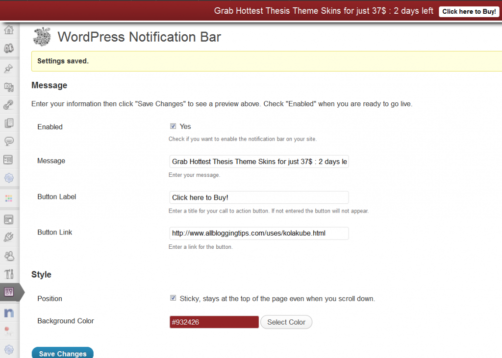
  3. Than goto Setting => Notification Bar
  4. And configure it as per your need. (See screenshot below!)

configure WP notification bar

5. Click on Save Changes and see your wordpress blog.

What you can do with Floating Notification Bar in WordPress?

  • You can show your popular post in floating notification bar.
  • You can show some important note to your visitors.
  • You can add link of some specific post.
  • You can also add a short link + text about any affiliate product and can earn money ;)

That’s all. I hope you will like my short but helpful tutorial about how to  Add Floating Notification Bar. Make sure to drop your comments below..

Stay Safe :D

How to Make Thesis Theme Responsive ?

By Ammar Ali 27 Comments

responsiveFinally, DIY Themes officially announced that now we can easily make thesis theme responsive with  “Responsive Skin + Child Theme Starter Set” for Thesis Theme.  All this work is done by Alex “the kid” Mangini. ;)
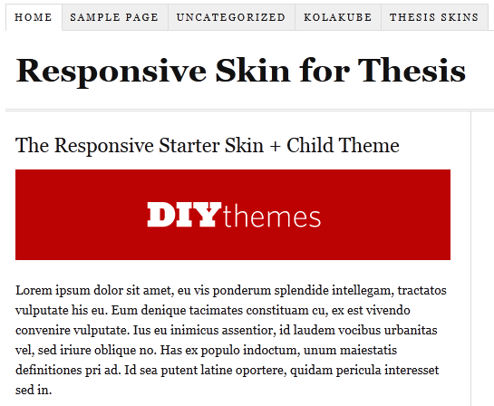
 
The starter kit is free. Here are thing which you need to make thesis theme responsive. 

  • Thesis Theme Framework (If you don’t have!)
  • Responsive Child Theme for Thesis
  • Responsive Starter Skin Set for Thesis

Some of you may be confused what is responsive design? Well, below I am writing a short info about what is responsive design!

What is responsive design?

Responsive design is, the design that will automatically adjust your website/blog/ based on width of device. You can say In the simple words, your blog will work perfectly on all the mobiles/smartphones/tablets without any mobile version WP plugin.

make thesis responsive

Now without wasting anytime. Let move on How to Make Thesis Theme Responsive ?

How to Make Thesis Theme Responsive ?

Below I am mentioning 2 simple ways you can do to make thesis theme responsive! If you are confused at any step just leave comment below :D

  • Manual Method.

Just download the thesis starter set and delete the current “ custom_functions.php ”  and  “ custom.css ” files  (remember to keep the backup of both the files in case if something went wrong ), then upload the custom_functions.php and custom.css files that you download recently from this link :) .

  • By Installing child theme easily !!

If you don’t want to manually upload the files, you can also use a child theme, instead. That won’t take much efforts from your side but it will only work with the fresh installations.

If you face any problem in installing that you are most welcome to ask any question in below comments. I will help you for sure :D

  • « Go to Previous Page
  • Page 1
  • Interim pages omitted …
  • Page 45
  • Page 46
  • Page 47
  • Page 48
  • Page 49
  • Interim pages omitted …
  • Page 72
  • Go to Next Page »

Primary Sidebar

Get Blogging & SEO Tips by Email

Get helpful blogging, SEO, and content tips delivered straight to your inbox. No spam.

Join 3,489 other subscribers

Popular Posts

  • Is Your Blog Properly Optimized for Performance and SEO?
  • 10 Powerful Ways to Become a Famous Blogger
  • Google AdSense vs Affiliate Marketing: A Simple Comparison for Beginners
  • Effective Ways to Increase Content Reach and Audience Engagement
  • 12 Things to Do Before Applying for Google AdSense
  • Are Backlinks Becoming Less Valuable in Modern SEO?
  • Step-by-Step Guide to Creating a Successful Travel Blog
  • How to Start as a Freelance Writer & Is It Worth?
  • Add Smooth Multi Level Drop-Down Menu In Blogger
  • How To Delete A Blogger Blog Permanently In 5 Minutes (+ FAQs)

Blogging Tools I Use

Over the years, I’ve tested dozens of blogging and WordPress tools. Below are the tools I personally use and recommend for blogging, performance, SEO, and monetization.

Blogging Tools I Use →

Categories

  • Announcement (12)
  • Ask The Readers (2)
  • Blogger (56)
    • Blogger Hacks (4)
    • Blogger Tips (24)
  • Blogging (108)
    • Blogging Tips (81)
    • Writing Tips (6)
  • Coupons (2)
  • Design (5)
  • Email Marketing (4)
  • Free Themes (1)
    • WordPress Themes (1)
  • Free Traffic (40)
    • Guest Blogging (7)
    • Search Engine Optimization (4)
    • Social Media (13)
  • Giveaway (16)
  • Hosting (14)
  • How To (48)
  • Latest News (1)
  • Make Money Online (37)
    • Adsense (7)
    • Affiliate Marketing (8)
  • Reviews (17)
  • SEO (46)
  • Social Media (13)
    • Facebook (5)
      • Tips and Tricks (3)
    • Twitter (2)
  • WordPress (54)
    • WordPress Plugins (17)
    • WordPress Themes (5)
    • WordPress Tricks (2)
    • WordPress Widgets (14)

Footer

About This Site

All Blogging Tips helps beginners learn how to start, grow, and monetize blogs using WordPress. I share practical guides and honest recommendations based on real blogging experience.

Read more →

Site & Resources

  • Tools I Use
  • About
  • Advertise Here
  • Contact
  • Disclosure Policy
  • Copyright Policy
  • Privacy Policy

Start & Grow Your Blog

  • A Ridiculously Helpful Guide to Start Your Own Blog In 10 Minutes
  • How To Grow Your Blog And Build An Audience
  • How To Make Money From Your Blog
  • Cheap WordPress Hosting
  • Free WordPress Hosting

Copyright © 2026 All Blogging Tips · Powered by InMotion Hosting · WordPress · Log in